UI/UX Design Strategies

The SAMM 2.0 framework is an evolution of the original application and therefore builds on its design strategies and business rules, while focussing on, and elevating data displayed in grids and forms, in a manner congruent with product owner’s requirements. This is achieved with a simplistic user interface and an intuitive user experience. All design decisions were made to improve legibility of text and ease-of-use of user interface elements. The suggested aesthetic is one of clear edges, few colors, and consistent icon and button systems that purposely eliminate distractions, so that the users' attention is devoted to the information they are intended to interact with. Every component design, color scheme, layout, image, button, gradient, and/or element of graphical nature has been created in-house by the Emprise Corporation Visual Communication Department and are subject to change at the discretion of the Product Owner.

General Rules for UI elements

Disclaimer

We can not mention UI Rules or guidelines without prefacing the discussion with an important note. SAMM is a web application that draws very heavily on User Experience patterns typically used in desktop and client-side applications. Therefore, it is difficult to define concrete rules based on either platform. Keeping this important fact in mind, most of the user experience and user interface guidelines established in this documentation will be heavily influenced by the rules and guidelines set forth in the Microsoft Windows Human Interface guidelines. Which can be found here.

It is the intention of the Emprise Corporation Visual Communication Department that the Windows guidelines be used solely as reference material when designing and developing SAMM. The following documentation is a living document, and as such, should be the groundwork for discussion on design and user interaction. If a question about design arises, Emprise Corporation’s design team should be consulted:

Sergio Barrera - Art Director
Liz Roy - Senior Designer
Jo Ray Tanchiatco - Senior Designer
Alan Nadaskay - Visual Designer
Kellie Semmelrock - Visual Designer

The CSS used in this document should not be considered production ready code. It is being used merely as a way to get the general idea of the styles across and as such should be used only as a reference for development purposes.

Please contact Troy Hawley or Mike Botsko for any questions regarding the usage of CSS from this document in the application.


Layout

The layout of the SAMM application is an important aspect of defining the standards for the user interface. Layout is based on spacing, sizes, and user interface element positioning. All of these aspects follow a standard that adheres to both common web application industry standards and a set of standards agreed upon by Emprise Corporation and its product owners.

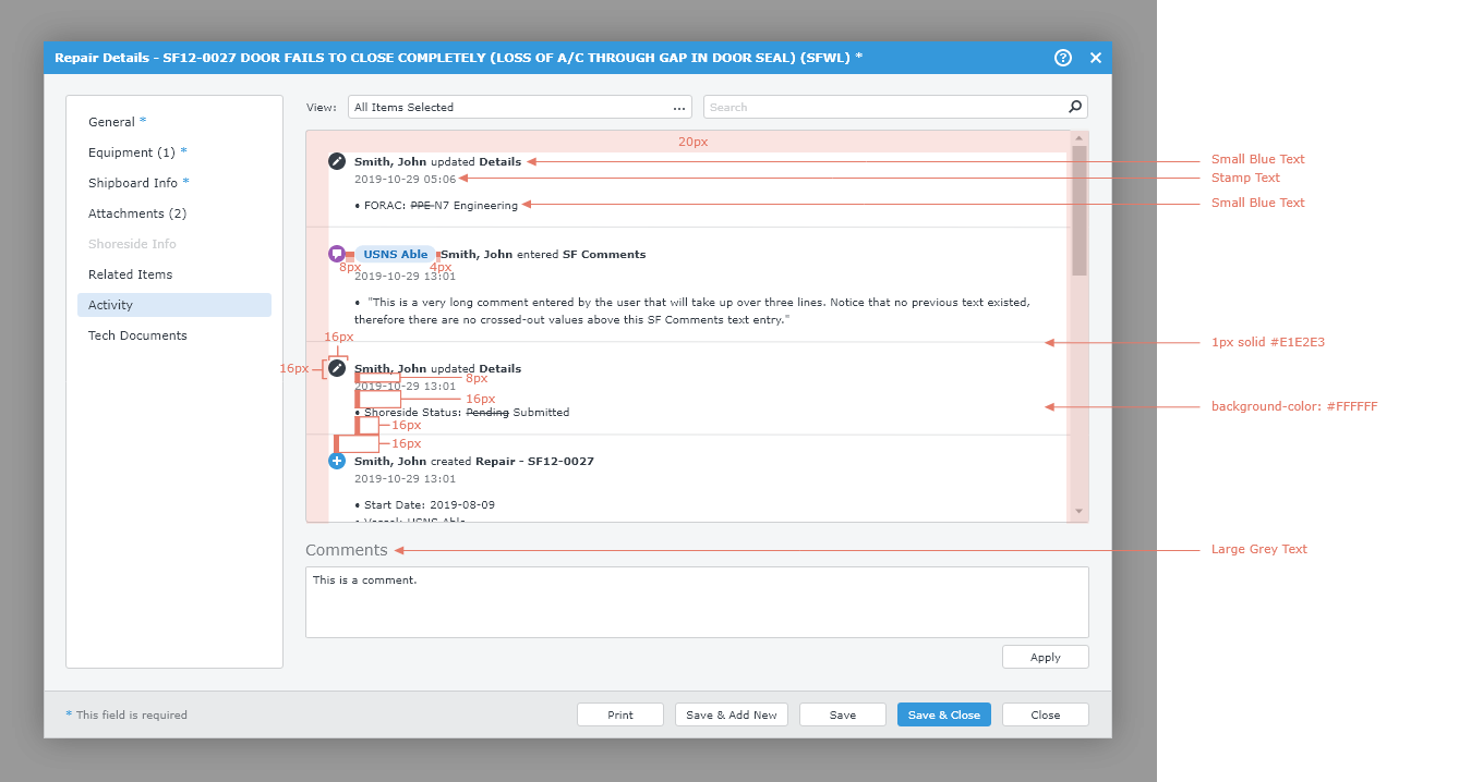
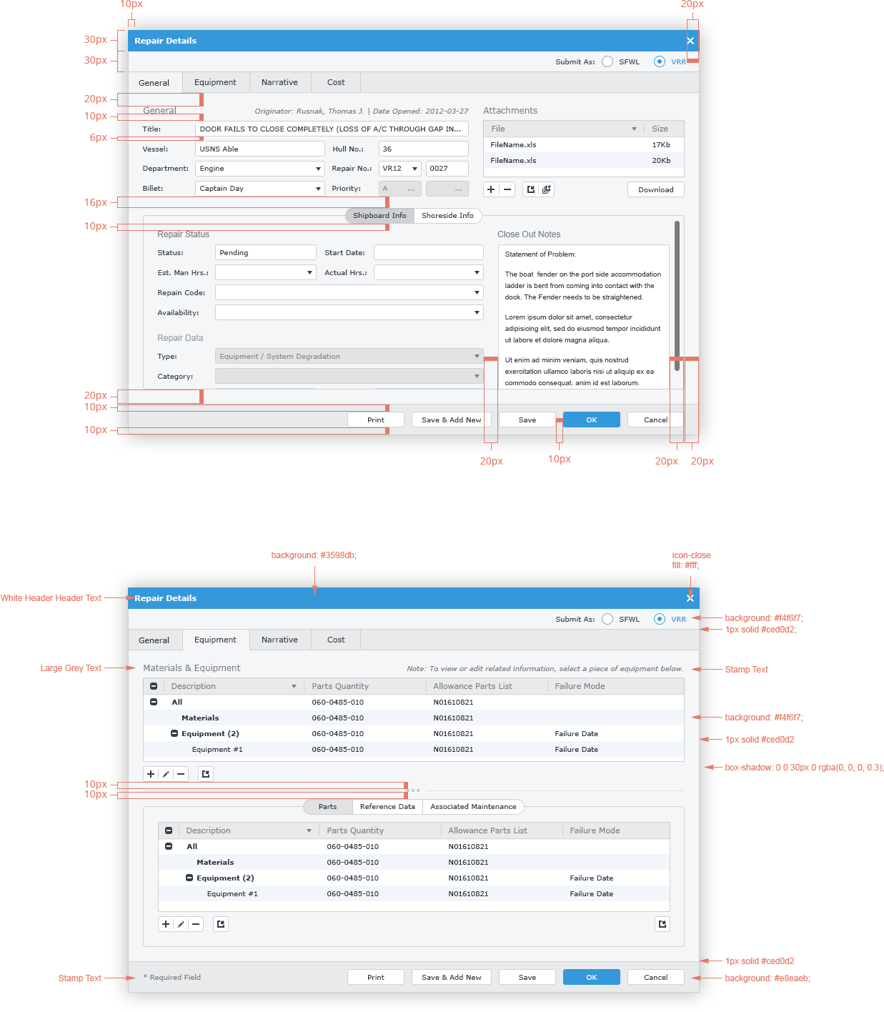
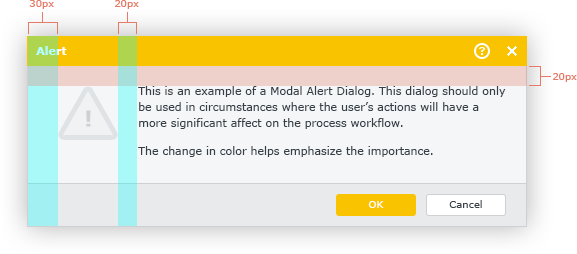
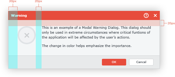
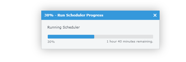
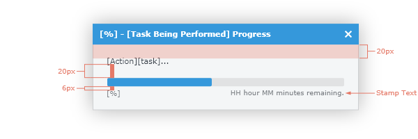
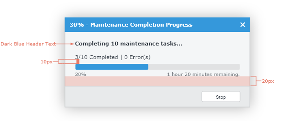
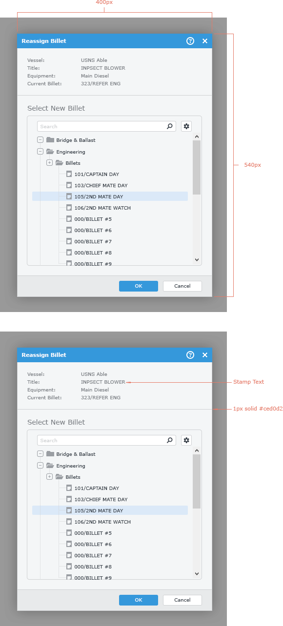
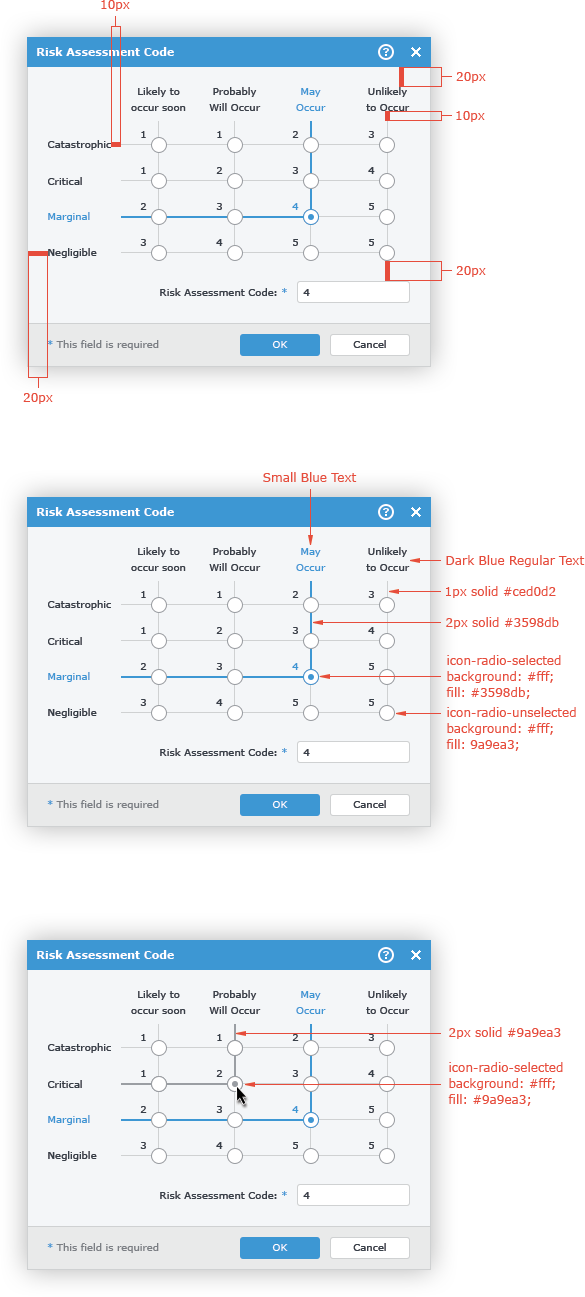
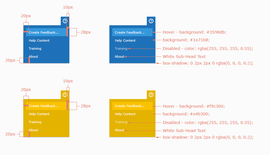
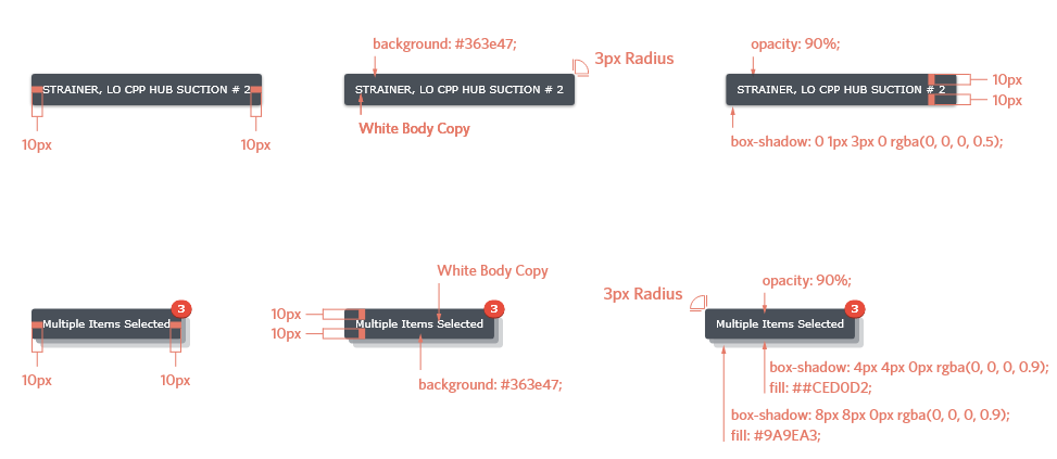
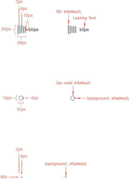
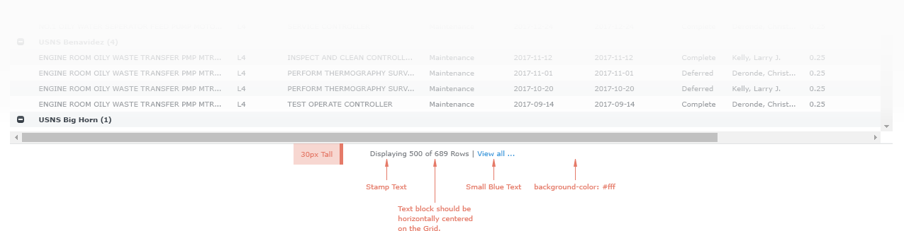
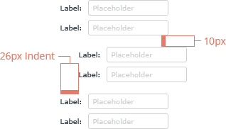
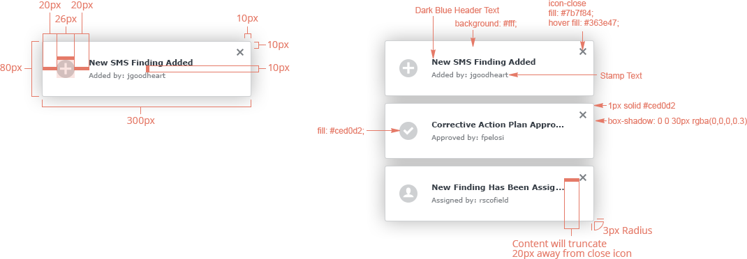
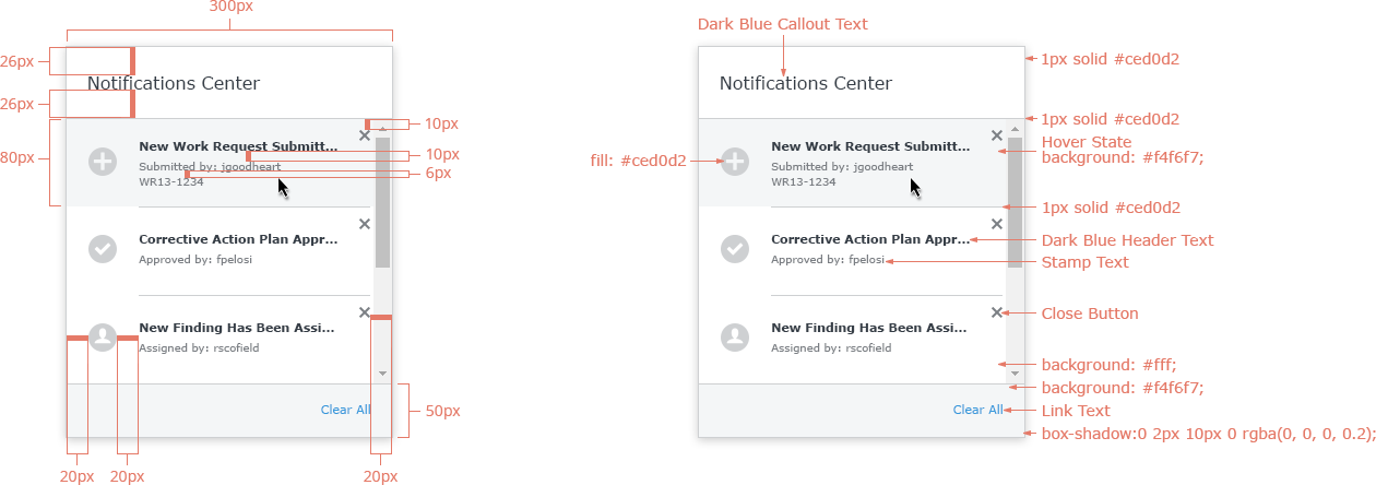
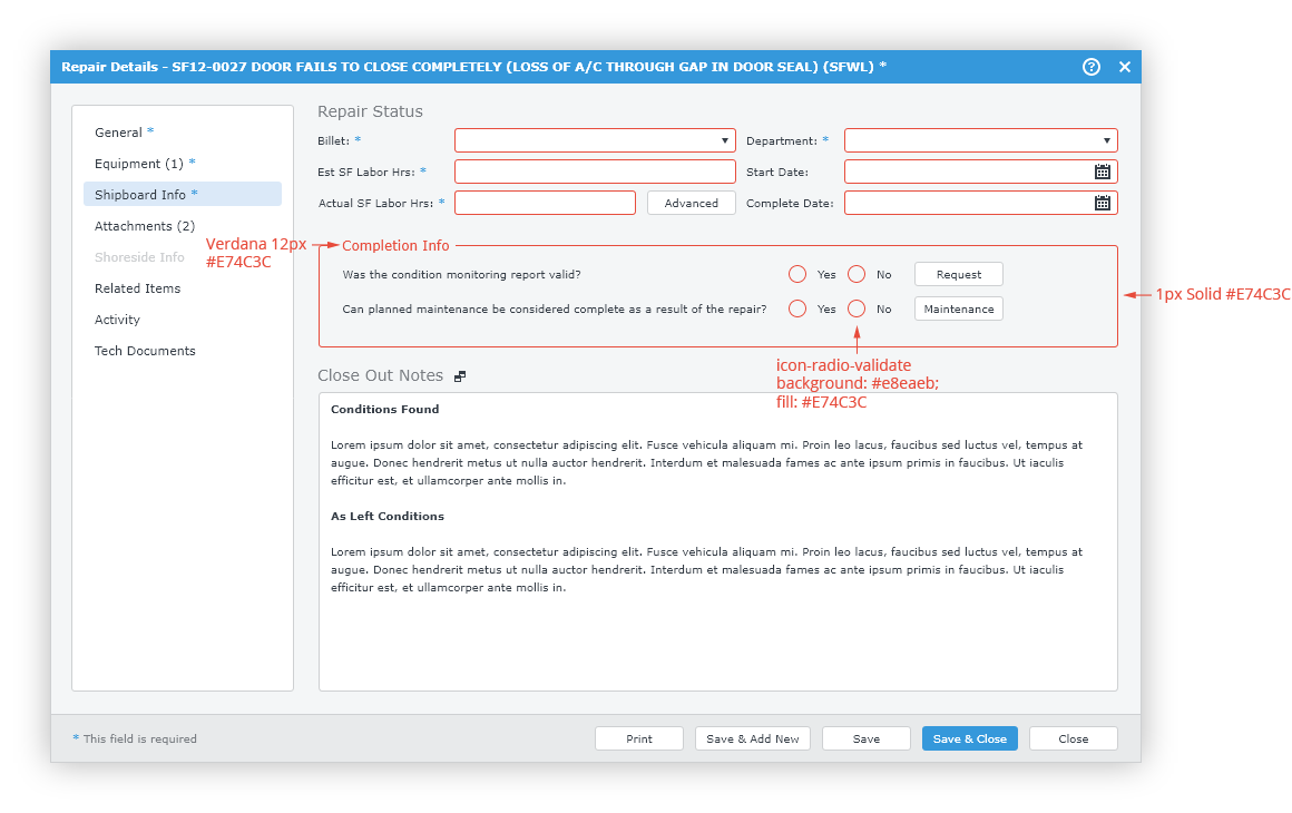
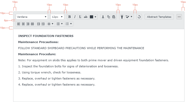
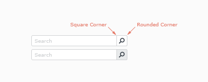
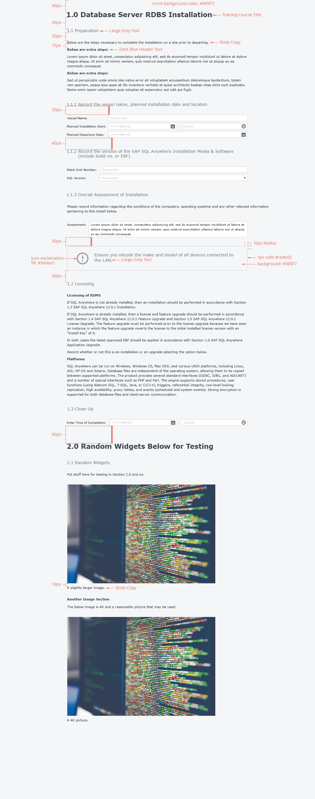
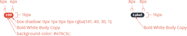
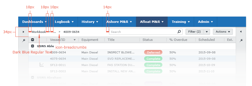
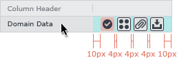
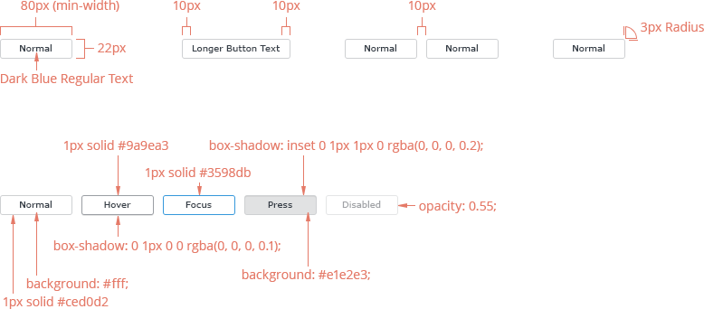
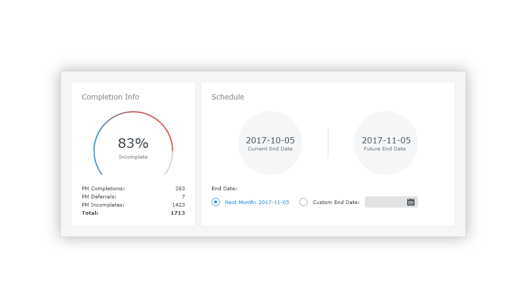
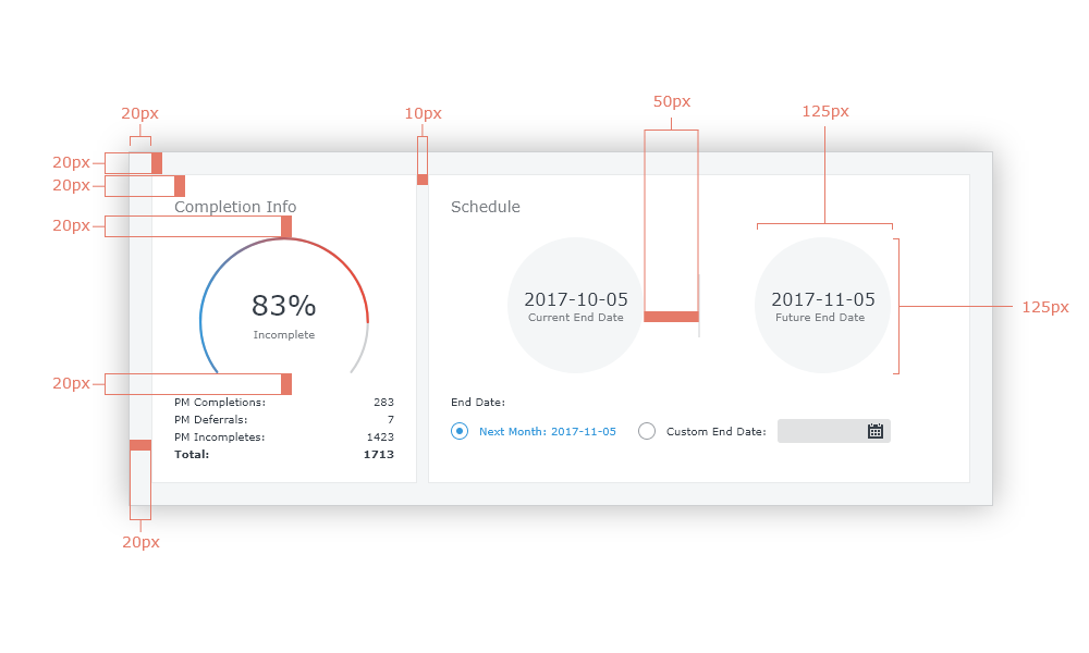
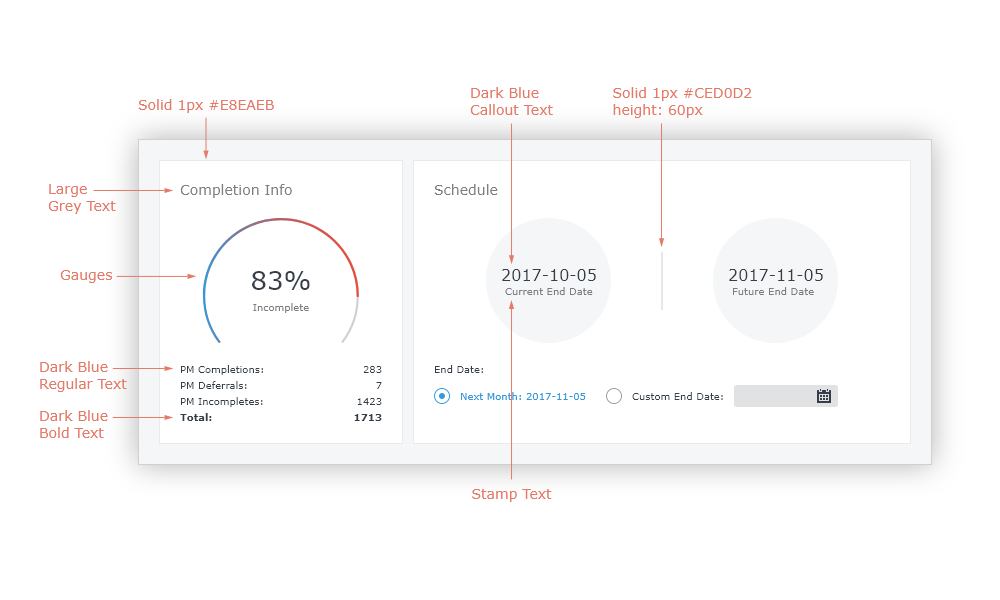
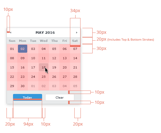
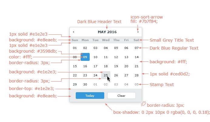
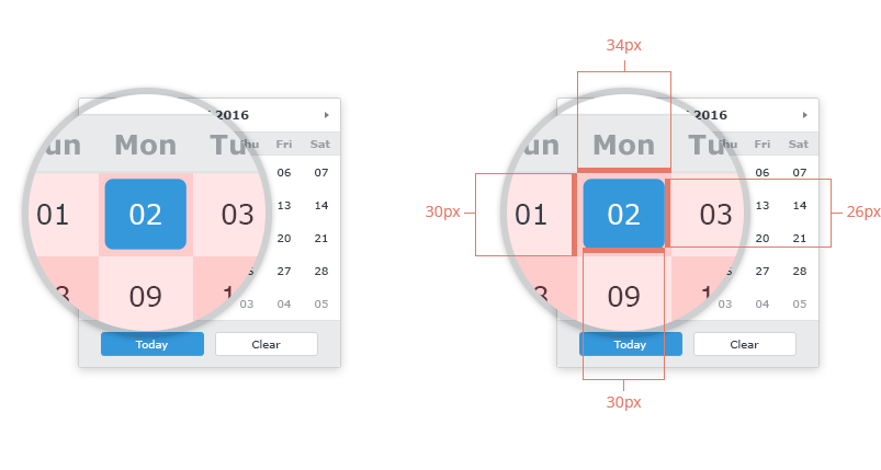
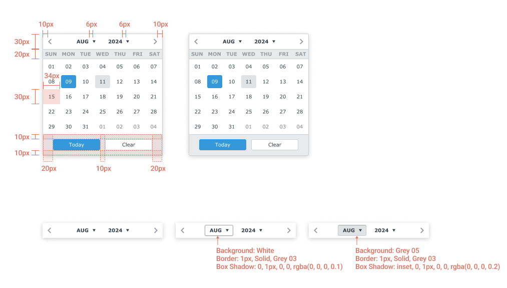
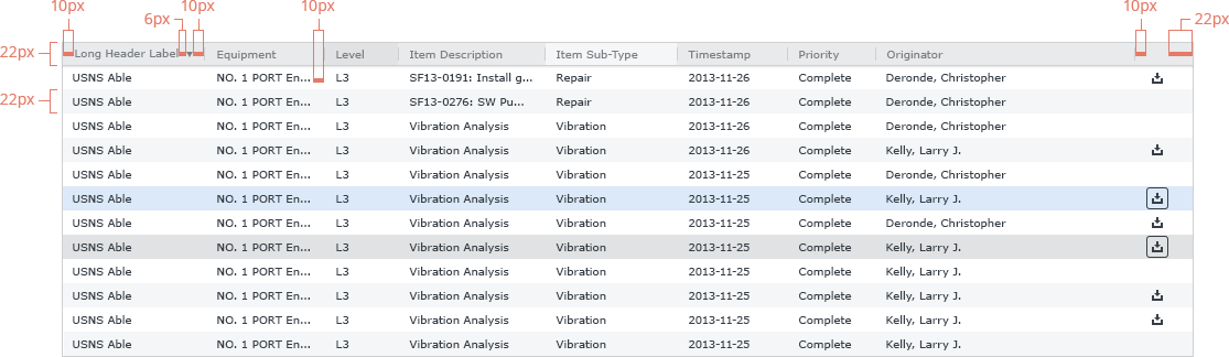
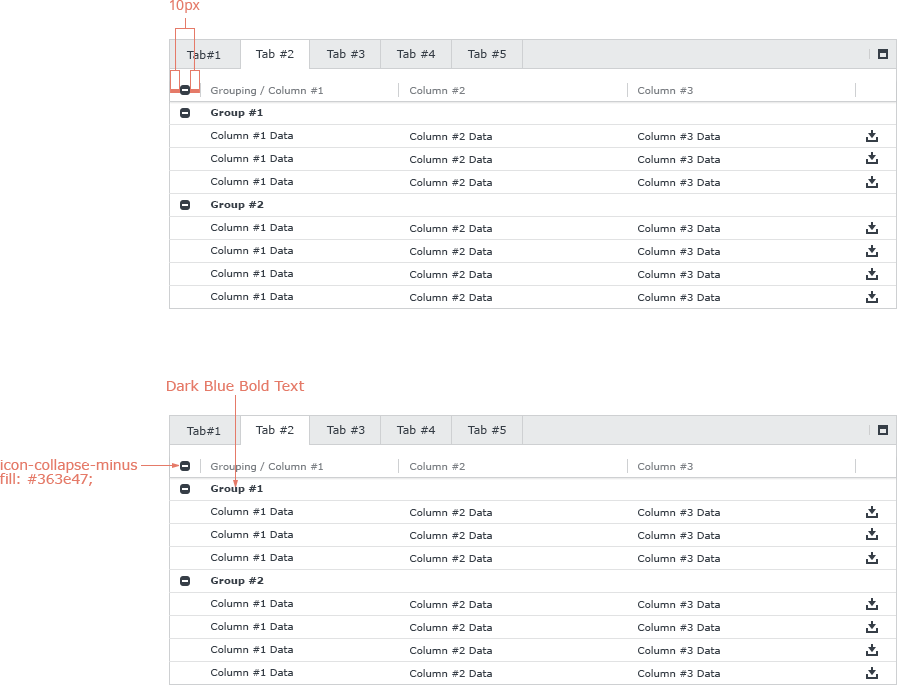
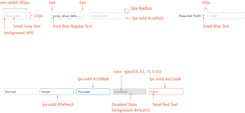
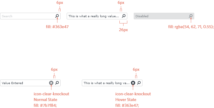
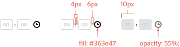
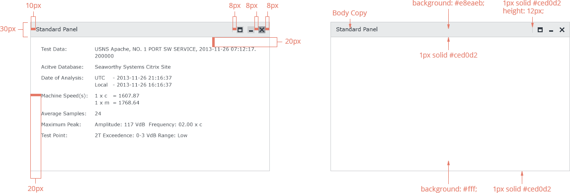
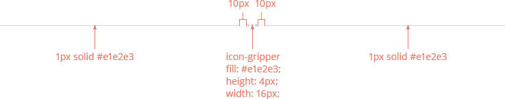
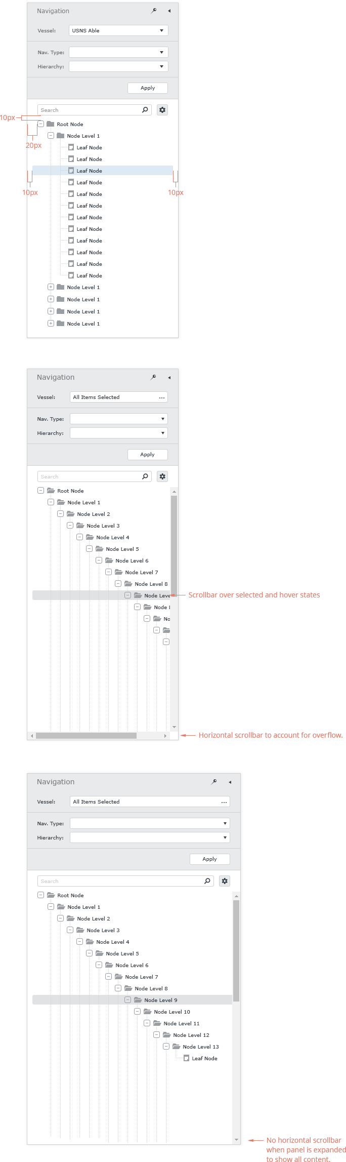
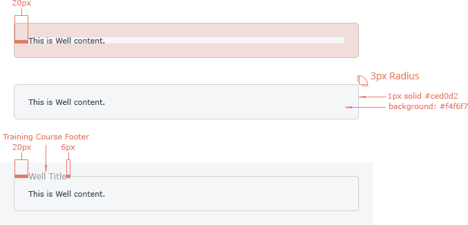
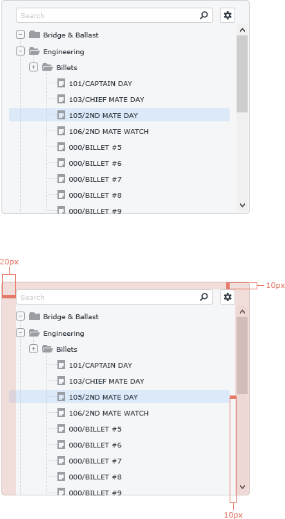
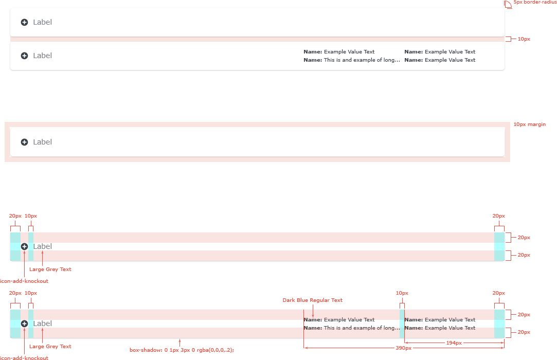
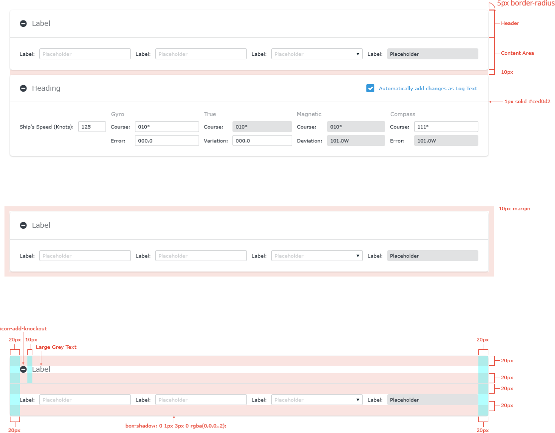
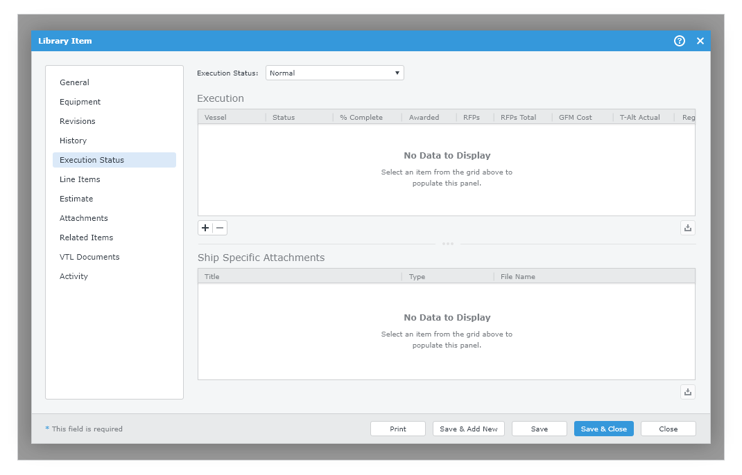
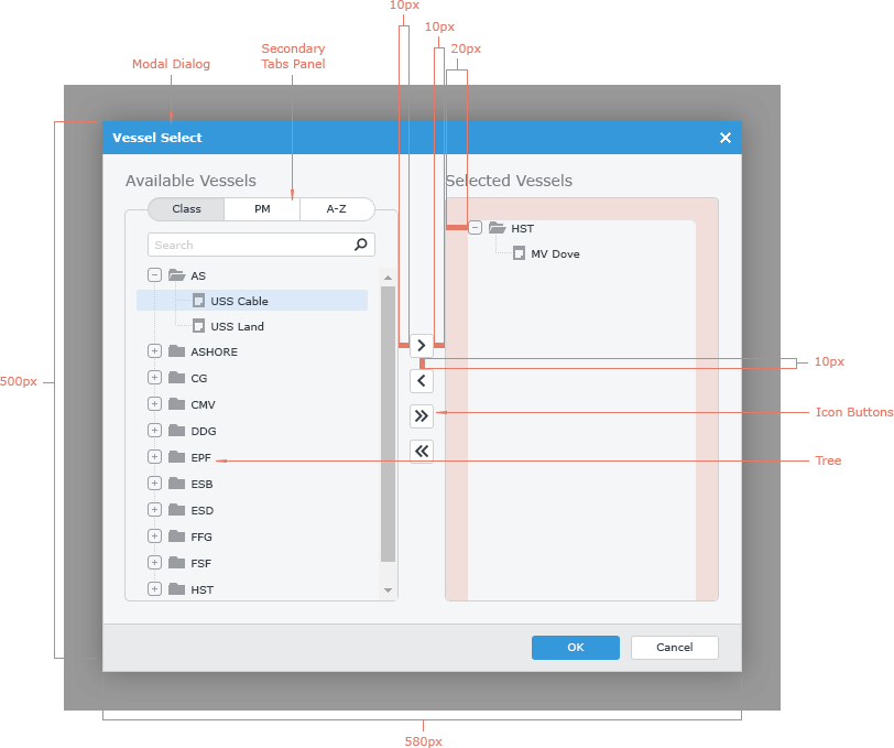
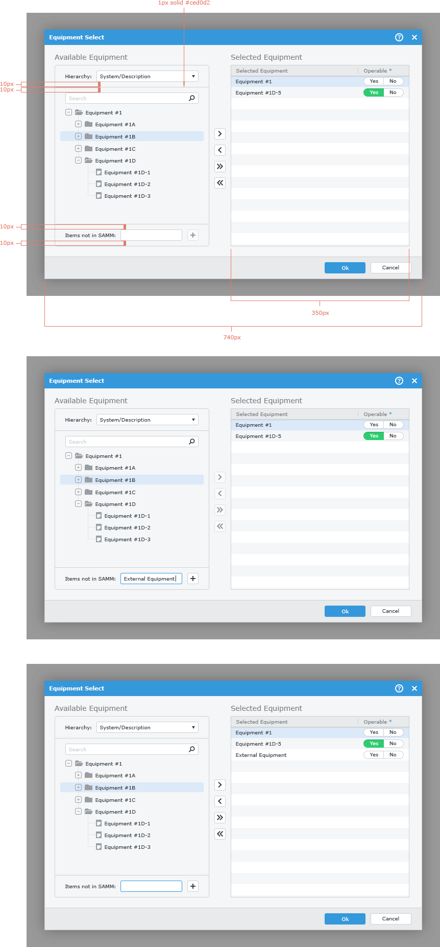
Spacing - All of the spacing in the SAMM application is based on an even 2px standard unit of measurement. This is especially important when dealing with spacing between and around elements of the user interface. Where ever possible, there should be 20px of padding as margins around more macro elements of the SAMM UI, such as modal windows or navigation panels. Also the visual pacing of the application is based on increments of 2px. It should be noted that, as with any rule, there is no way that it can cover every possible scenario. The design, in every way possible will adhere to this rule, but there will be times that the rule will need to be broken in order to facilitate good design. These scenarios will need to be discussed with Product Owners and the Visual Communication Department before being implemented.

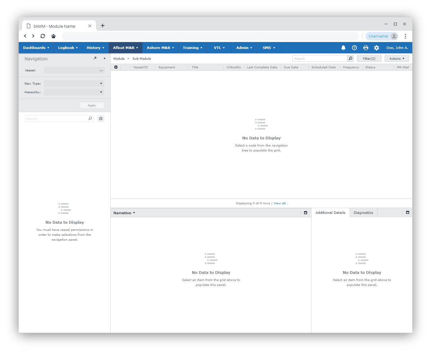
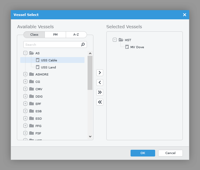
Positioning - When it comes to positioning, the SAMM user interface follows a somewhat standard format for web applications and adheres to many of the Microsoft Windows design standards as well.

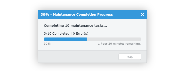
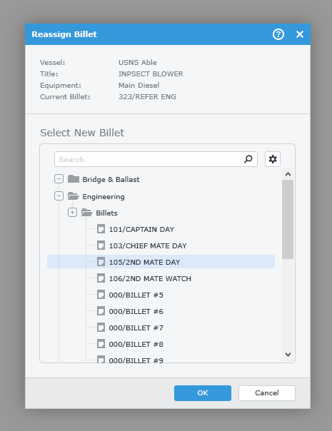
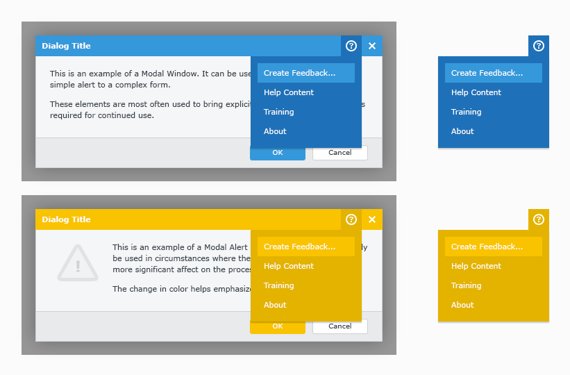
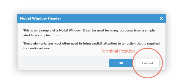
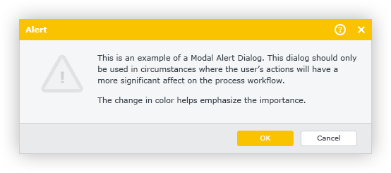
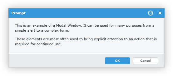
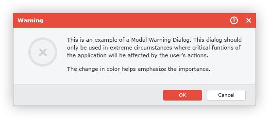
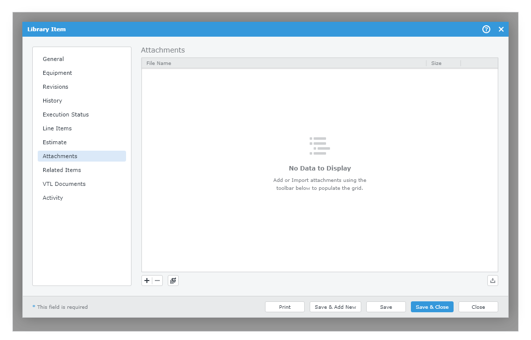
Button Positioning - Following that general mentality when positioning buttons, especially in modal windows, the button with the negative connotation should be positioned in the terminal position for the element. In the case of modal windows or forms it would be the lower right hand corner in a footer. The button that contains the action considered most important for the particular window should use theAccented Button styles and should be positioned immediately adjacent to the terminal position, unless otherwise specified.
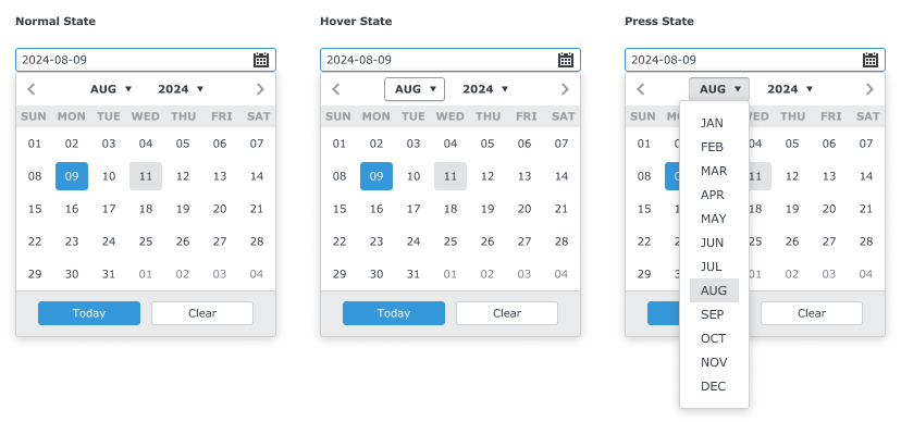


The Cursor

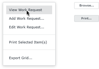
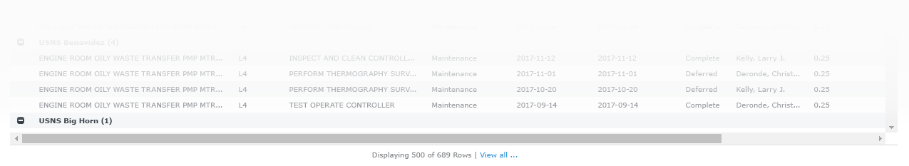
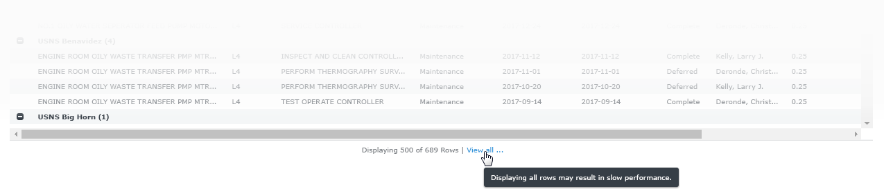
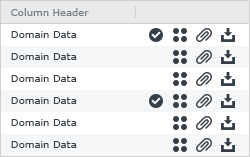
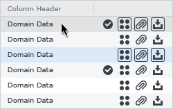
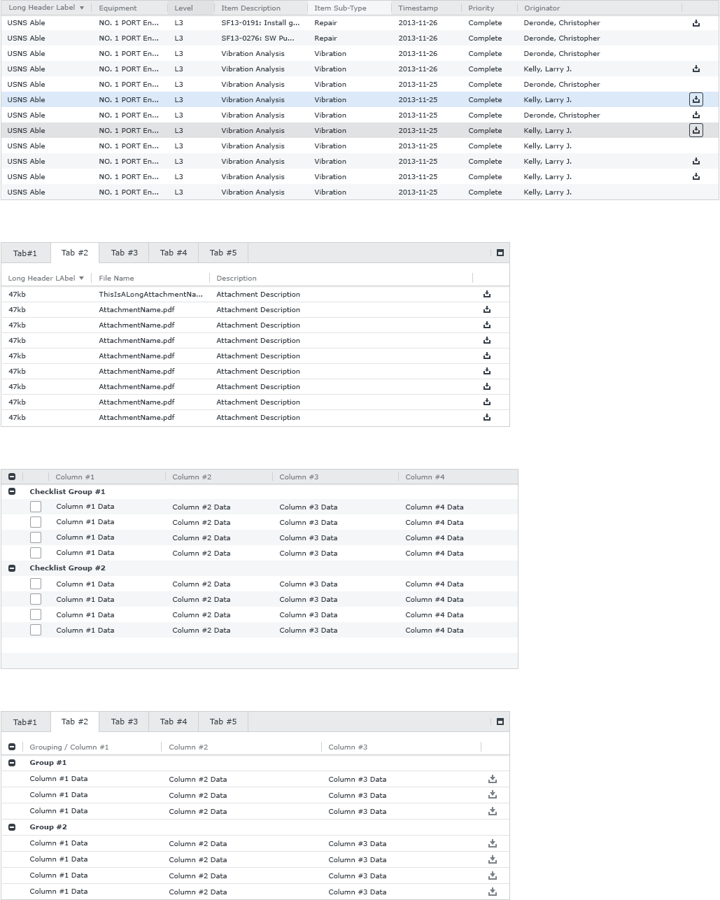
The cursor, in SAMM, will use the rules set forth in the Microsoft Window Human Interface Guidelines as a base and add to the rules where it is needed. Those rules can be found here.The vast majority of interface elements will display the "Normal Selector" (arrow). However, there will be a select few locations where the "Link Selector" (finger) will need to be used. An example of one of these locations is the "View all..." link in the footer of the main module grid. If other cursor types are be needed, they will be defined in the guidelines for the indiviual UI element.

Language

This section of the SAMM Documentation is designed to establish some standard language to be used throughout the application. This language will be applied to alerts, error messages, confirmation dialogs, warnings, or any other text that supports the usability of SAMM. More language may be added in the future. For any questions regarding language please contact the Emprise Corporation Visual Communication Department.

Situational Language for Dialogs

Case Dialog Type Dialog Title Message Footer Buttons
Unsaved Changes Alert Alert Unsaved Changes Would you like to save your changes before proceeding?
All unsaved changes will be lost.
Save (Accented), Don't Save, Cancel
502 Confirmation 502 Error There was an issue returning your grid results. Please try again. If you continue to have issues try adjusting your filters. Close
503 Confirmation 503 Error We are having trouble connecting to the server.  Please wait a few minutes and try again. If you continue to experience this problem please contact the help desk. Close
504 Confirmation 504 Error It's taking too long to return your grid results. Please adjust your filters and try again. Close
Unsupported File Type Confirmation Unsupported File Type The file type that you are attempting to upload is not supported. Please Select another file and try again.

Supported file types include: [insert supported file type list]
Close
Upload Size Exceeds Size Limit Confirmation Upload Limit Exceeded Your upload size exceeds the allowable limit.
File size must be smaller than 50MB.
Close

Alerts

Alerts, in SAMM, are a set of dialogs that "alert" the user to actions that can cause problems in the future, possible loss of data, or substantial changes to that data that can occur if they continue their current course of action. These dialogs have yellow headers and Accented Buttons in order to emphasize that, while the current action is not critical to the functionality of the application, it could still have undesirable consiquences.

Please refer to the Dialogs section of this documentation for styling specifications pertaining to Alert Dialogs.

Example

Confirmation Dialogs

Confirmation dialogs, in SAMM, are a set of dialogs that provide additional information the user needs to perform their current action. These Dialogs use the typical blue headers and Accented Buttons for standard Modal Dialogs as these messages are intended to have a neutral tone.

Please refer to the Dialogs section of this documentation for styling specifications pertaining to Prompt Dialogs.

Example

Warnings

Warnings, in SAMM, are a set of dialogs that "warn" the user that their current action could have critical consequences to the functionality of the application. These dialogs have red headers and Accented Buttons in order to emphasize that the user's actions could result in critical failures of the application.

Please refer to the Dialogs section of this documentation for styling specifications pertaining to Warning Dialogs.

Example

Situational Language for Tooltip Validations

Below is a list of common tooltip validation messages that may appear when an error occurs in SAMM. These messages are designed to be straightforward and generic for scalability purposes. However, there may be instances within the application where none of the predefined messages suit a specific input field. In such cases, please reach out to the Emprise Corporation Visual Communication Department for guidance on the next steps.


Case Input Type Tooltip Message Example
Invalid Format Invalid format.
Negative Integer Entered Please enter a positive
integer value.
Null Required Field This field is required.

Color Palette

SAMM 2.1 | Approved | Last Updated: 2016-01-27

The color scheme in SAMM is designed to place emphasis on the information being viewed without being distracting to the user. The aesthetic of the application is intended to be modern and functional. The colors described below are present in the most commonly viewed interface elements and components. Grey, blue, red, and white are the base colors from which the graphical treatments in the application are derived. Deviations in color should be meaningful and are subject to review by the Visual Communication Department at Emprise Corporation.

Color Swatches

  • Grey 01

    #363e47

  • Grey 02

    #7b7f84

  • Grey 03

    #9a9ea3

  • Grey 04 - Base

    #ced0d2

  • Grey 05

    #e1e2e3

  • Grey 06

    #e8eaeb

  • Grey 07

    #f4f6f7

  • blank

    blank

  • Blue 01

    #2c4e7b

  • Blue 02

    #365e92

  • Blue 03

    #1e71b8

  • Blue 04 - Base

    #3598db

  • Blue 05

    #3dabf5

  • Blue 06

    #dbe9f8

  • blank

    blank

  • Red 01

    #8d281e

  • Red 02 - Base

    #e74c3c

  • Red 03

    #b86354

  • Red 04

    #e57a68

  • blank

    blank

  • Yellow 01

    #c69b00

  • Yellow 02

    #e4b300

  • Yellow 03 - Base

    #f9c300

  • Yellow 04

    #ffd12d

  • blank

    blank

  • Purple 01

    #3b1f47

  • Purple 02 - Base

    #9b59b6

  • Purple 03

    #f5ddfd

  • blank

    blank

  • Green 01 - Base

    #2ecc71

  • Green 02

    #59D98F

  • Orange 01 - Base

    #f79f1f

  • blank

    blank

Badges & Pills

SAMM 2.1 | Approved | Last Updated: 2016-06-15

The Badges in SAMM are used to draw attention to actions or information that the user needs to address in either in a timely manner or by performing an important action. Some common uses for these might be to indicate that the user has some notifications that they have yet to read, or that a task has been rescheduled several times and that it needs to be addressed.

Pills are another visual element that are used to call particular attention to important information in the application. Currently, their most common usage is as a status indicator in the Workbook Sub-Module in SAMM, where they appear in multiple colors to indicate different deferral statuses.

Examples

42

Scheduled Scheduled Deferred Complete

Specifications

Note: When a Pill is being used in a Grid as a status indicator it will have a min-width: 76px; associated with it. Otherwise the Pill will be a variable width based on the size of its content.


Name Examples This State Trumps: Fonts
Badges 42 n/a Bold White Body Copy
Pill: Scheduled Scheduled n/a Bold White Body Copy
Pill: Scheduled w/ Special Tests Scheduled n/a Bold White Body Copy
Pill: Deferred Deferred n/a Bold White Body Copy
Pill: Complete Complete n/a Bold White Body Copy


Examples Background Fill Fonts
Example Grey 01 Bold White Body Copy
Example Grey 02 Bold White Body Copy
Example Grey 03 Bold White Body Copy
Example Grey 04 Bold White Body Copy
Example Grey 05 Dark Blue Bold Text
Example Grey 06 Dark Blue Bold Text
Example Grey 07 Dark Blue Bold Text
Example Blue 01 Bold White Body Copy
Example Blue 02 Bold White Body Copy
Example Blue 03 Bold White Body Copy
Example Blue 04 Bold White Body Copy
Example Blue 05 Bold White Body Copy
Example Blue 06 Dark Blue Bold Text
Example Red 01 Bold White Body Copy
Example Red 02 Bold White Body Copy
Example Red 03 Bold White Body Copy
Example Red 04 Bold White Body Copy
Example Yellow 01 Bold White Body Copy
Example Yellow 02 Bold White Body Copy
Example Yellow 03 Bold White Body Copy
Example Yellow 04 Bold White Body Copy
Example Purple 01 Bold White Body Copy
Example Green 01 Bold White Body Copy
Example Orange 01 Bold White Body Copy

Buttons: Accented Buttons

SAMM 2.1 | Approved | Last Updated: 2016-06-16

Accented Buttons are used to emphasize the most important action when there is a series of actions to be performed. The design and functionality of Accented Buttons are largely the same as those of the Primary Buttons with some minor tweaks to make them really stand out and call attention.

Examples

Specifications

The Accented Buttons in SAMM may come in a variety of colors. Below is a listing of two of these color variations. More variations may arise in the future and are subject to change or approval by the Visual Communication Department at Emprise Corporation.

Business Rule: The ellipsis should be used on any clickable button or link that will prompt the user to perform further action after clicking the button or link.

Business Rule: In keeping with Microsoft Windows desktop patterns, the focus states for buttons in SAMM should be used primarily for indicating what element the user is currently acting upon while tabbing through the application. The other states of the buttons will almost always take precedence over the focus state. There will, of course, be exceptions to this rule. When this is the case it will be clearly documented for the individual element. Any questions regarding this rule should be fielded by the Emprise Visual Communication Department.

Blue Accented Buttons

CSS Note: The Normal state for Accented Buttons should have a transition: all 0.3s ease-in; on it. All other states should have a transition: all 0.125s ease-out; on them. This creates a faster transition into each state while having a smooth subtle transition back to the Normal state.


Name Examples This State Trumps: Fonts
Normal None White Body Copy
Hover Normal, Focus White Body Copy
Focus Normal White Body Copy
Active/Press Normal, Hover, Focus White Body Copy
Disabled All White Body Copy

Yellow Accented Buttons

CSS Note: The Normal state for Accented Buttons should have a transition: all 0.3s ease-in; on it. All other states should have a transition: all 0.125s ease-out; on them. This creates a faster transition into each state while having a smooth subtle transition back to the normal state.


Name Examples This State Trumps: Fonts
Normal None White Body Copy
Hover Normal, Focus White Body Copy
Focus Normal White Body Copy
Active/Press Normal, Hover, Focus White Body Copy
Disabled All White Body Copy

Red Accented Buttons

CSS Note: The Normal state for Accented Buttons should have a transition: all 0.3s ease-in; on it. All other states should have a transition: all 0.125s ease-out; on them. This creates a faster transition into each state while having a smooth subtle transition back to the normal state.


Name Examples This State Trumps: Fonts
Normal None White Body Copy
Hover Normal, Focus White Body Copy
Focus Normal White Body Copy
Active/Press Normal, Hover, Focus White Body Copy
Disabled All White Body Copy

Buttons: Button Dropdowns

SAMM 2.1 | Approved | Last Updated: 2016-06-17

Button Dropdowns are designed to work as another element for actions to be stored and hidden within. This element is used similarly to the split button but it performs only the action of opening the dropdown rather than having two separate actions.

The most common usage for Button Dropdown in SAMM are the "Actions" menus. These appear above the main grid in each sub-module and typically house actions that relate to the grid itself.

Specifications

Button Dropdowns can use the styles from Accented Buttons, Primary Buttons and Secondary Buttons depending on where they are being used. The Visual Communication Department should be consulted when determining which style to use for any given scenario. Please refer to the respective sections of this documentation for styles specific to each of the aforementioned buttons.

Regardless of the button styles being used for the Button Dropdown itself, the Dropdown menu that appears when the user clicks on the button will be the same.

Business Rule: In keeping with Microsoft Windows desktop patterns, the focus states for buttons in SAMM should be used primarily for indicating what element the user is currently acting upon while tabbing through the application. The other states of the buttons will almost always take precedence over the focus state. There will, of course, be exceptions to this rule. When this is the case it will be clearly documented for the individual element. Any questions regarding this rule should be fielded by the Emprise Visual Communication Department.

Note: Please see the Context & Dropdown Menus section for details on the dropdown associated with these buttons.

Buttons: Button Groups

SAMM 2.1 | Approved | Last Updated: 2018-02-15

Button Groups are designed to serve several purposes in the SAMM interface.

The most common usage for Button Groups in SAMM is toolbars. These can appear below grids, in modal windows and anywhere else they may be needed. Usage of button groups as toolbars is subject to approval by the Emprise Visual Communication Department and Product Owners.

Examples

Specifications

Button Groups can use the styles from Accented Buttons, Primary Buttons and Secondary Buttons depending on where they are being used. The Visual Communication Department should be consulted when determining which style to use for any given scenario.

Business Rule: In keeping with Microsoft Windows desktop patterns, the focus states for buttons in SAMM should be used primarily for indicating what element the user is currently acting upon while tabbing through the application. The other states of the buttons will almost always take precedence over the focus state. There will, of course, be exceptions to this rule. When this is the case it will be clearly documented for the individual element. Any questions regarding this rule should be fielded by the Emprise Visual Communication Department.


CSS Note: Please be aware that, while the examples below are defined using fonts for the content within button groups, most buttons groups will contain icons instead. We are using the fonts below in order to cover as many scenarios as we possibly can with this documentation. The icons will be sized to match their canvas size, unless otherwise stated elsewhere, and the fill color will be as defined above, unless otherwise stated.

Primary Button Groups

CSS Note: The Normal state for Button Groups should have a transition: all 0.3s ease-in; on it. All other states should have a transition: all 0.125s ease-out; on them. This creates a faster transition into each state while having a smooth subtle transition back to the Normal state.


Name Examples This State Trumps: Fonts
Normal None Dark Blue Regular Text
Hover Normal, Focus Dark Blue Regular Text
Focus Normal Dark Blue Regular Text
Error Normal, Hover, Focus, Active/Pressed Dark Blue Regular Text
Active/Press Normal, Hover, Focus Dark Blue Regular Text
Disabled All Dark Blue Regular Text

Secondary Button Groups

CSS Note: The Normal state for Button Groups should have a transition: all 0.3s ease-in; on it. All other states should have a transition: all 0.125s ease-out; on them. This creates a faster transition into each state while having a smooth subtle transition back to the Normal state.


Name Examples This State Trumps: Fonts
Normal None Dark Blue Regular Text
Hover Normal, Focus Dark Blue Regular Text
Focus Normal Dark Blue Regular Text
Error Normal, Hover, Focus, Active/Pressed Dark Blue Regular Text
Active/Press Normal, Hover, Focus Dark Blue Regular Text
Disabled All Dark Blue Regular Text

Buttons: Icon Buttons

SAMM 2.1 | Approved | Last Updated: 2017-03-22

Icon Buttons are used in SAMM to conserve space on actions that are easily recognizable with visual stimuli.

Icon Buttons appear in multiple locations throughout the application and therefore have several style attributed associated with them. These styles are designed to allow the icons to be as easily readable as possible in every scenario.

Examples

Specifications

All Icon Buttons use icons from the SAMM 2.0 Icon SVG package. The documentation for which can be found in the Iconography section of this document.

Business Rule: In keeping with Microsoft Windows desktop patterns, the focus states for buttons in SAMM should be used primarily for indicating what element the user is currently acting upon while tabbing through the application. The other states of the buttons will almost always take precedence over the focus state. There will, of course, be exceptions to this rule. When this is the case it will be clearly documented for the individual element. Any questions regarding this rule should be fielded by the Emprise Visual Communication Department.


Main Navigation Buttons

CSS Note: The Normal state for Icon Buttons should have a transition: all 0.3s ease-in; on it. All other states should have a transition: all 0.125s ease-out; on them. This creates a faster transition into each state while having a smooth subtle transition back to the Normal state.


Name Examples This State Trumps: Fonts
Normal None N/A
Hover Normal, Focus N/A
Focus Normal N/A
Active Normal, Hover, Focus N/A
Disabled All N/A


Window Header Buttons

CSS Note: The Normal state for Icon Buttons should have a transition: all 0.3s ease-in; on it. All other states should have a transition: all 0.125s ease-out; on them. This creates a faster transition into each state while having a smooth subtle transition back to the Normal state.


Name Examples This State Trumps: Fonts
Normal None N/A
Hover Normal, Focus N/A
Focus Normal N/A
Active Normal, Hover, Focus N/A
Disabled All N/A


Panel Header Buttons

CSS Note: The Normal state for Icon Buttons should have a transition: all 0.3s ease-in; on it. All other states should have a transition: all 0.125s ease-out; on them. This creates a faster transition into each state while having a smooth subtle transition back to the Normal state.


Name Examples This State Trumps: Fonts
Normal None N/A
Hover Normal, Focus N/A
Focus Normal N/A
Active Normal, Hover, Focus N/A
Disabled All N/A


Sidebar Navigation & Quick Edit Buttons

Navigation and Quick Edit Panel Buttons use the styles for Secondary Buttons aside from the Normal state which strips all styles off of the button accept for the icon itself. These buttons should be 10px apart from one another, both in the the horizantal and vertical layouts of the navigation.


CSS Note: The Normal state for Icon Buttons should have a transition: all 0.3s ease-in; on it. All other states should have a transition: all 0.125s ease-out; on them. This creates a faster transition into each state while having a smooth subtle transition back to the Normal state.


Name Examples This State Trumps: Fonts
Normal None N/A
Hover Normal, Focus N/A
Focus Normal N/A
Active Normal, Hover, Focus N/A
Disabled All N/A


Grid Icon Buttons

Icon buttons that appear in grids have a slightly more complicated behavior than other buttons.

When Grid Icon Buttons are static they will appear as icons in the grid, suach as the example below. This serves the purpose of allowing them to also be used as indicators.


When the row containing interactive buttons is hovered or selected the icons will display a button border as is the case in the example below.

Important Note: The check-knockout icon below does not have a border when the row is hovered because only icons that are interactive in the grids will get the row hovered and selected states.


CSS Note: The spacing between buttons in a cell, as well, as the spacing to the left and right of the group of buttons within that cell should be determined using this button border rather than the icon within it. This include non-interactive icons. It should be assumed that the same spacing exists around the non-interactive buttons as the interactive one even though they do not display a border when hovered. Refer to the example below.


In addition to the row hover and selected states each button has its own hover, focused, and disabled states.


CSS Note: Be advised that icons within these buttons will need to conform to a 14px x 14px viewbox as in the example above. If this requires new icon production files, please contact the Emprise Corporation Visual Communication Department to have them made.

CSS Note: All states for Grid Icon Buttons should have a transition: all 0.125s linear; on it. This is different from other buttons because these will be so tightly packed in the UI that we will need them to respond more quickly in order to not clutter the UI with unnecessary visuals.


Name Examples This State Trumps: Fonts
Normal None N/A
Row Hover Normal N/A
Hover Normal, Row Hover N/A
Focus Normal, Row Hover N/A
Disabled All N/A

Buttons: Primary Buttons

SAMM 2.1 | Approved | Last Updated: 2016-06-17

Buttons in the SAMM application are styled to match the clean minimalistic aesthetic of the overall user interface. Buttons appear in a large amount of the elements in the SAMM user interface and represent a large amount of what the user will actually be interacting with. Therefore, the buttons' messages must be clean, clear, and concise to make navigation as intuitive as possible. A Primary Button consists of text and/or an image that clearly communicates what action will occur when the user clicks on it. The Primary Button will be used in cases in which an action needs to be performed.

Examples

Specifications

Business Rule: The ellipsis should be used on any clickable button or link that will prompt the user to perform further action after clicking the button or link.

Business Rule: In keeping with Microsoft Windows desktop patterns, the focus states for buttons in SAMM should be used primarily for indicating what element the user is currently acting upon while tabbing through the application. The other states of the buttons will almost always take precedence over the focus state. There will, of course, be exceptions to this rule. When this is the case it will be clearly documented for the individual element. Any questions regarding this rule should be fielded by the Emprise Visual Communication Department.

CSS Note: The Normal state for Primary Buttons should have a transition: all 0.3s ease-in; on it. All other states should have a transition: all 0.125s ease-out; on them. This creates a faster transition into each state while having a smooth subtle transition back to the Normal state.


Name Examples This state Trumps: Fonts
Normal None Dark Blue Regular Text
Hover Normal, Focus Dark Blue Regular Text
Focus Normal Dark Blue Regular Text
Active Normal, Hover, Focus Dark Blue Regular Text
Disabled All Dark Blue Regular Text

Buttons: Secondary Buttons

SAMM 2.1 | Approved | Last Updated: 2016-06-21

The Primary and Accented buttons are both styled in a manner that allows them to easily be picked out of an interface as being the most important actions. However, there are some cases in which a button does not need to be so readily apparent. For these situations a secondary type of button was designed. These buttons are used in more micro elements throughout the SAMM interface. A good examply of this would be forms within modal windows, there buttons that comprise the navigation for the modal window are far more important than the buttons within the form.

Business Rule: As with the Primary and Accented buttons the ellipsis should be used on any clickable button or link that will prompt the user to perform further action after clicking the button or link.

Examples

Specifications

Business Rule: The ellipsis should be used on any clickable button or link that will prompt the user to perform further action after clicking the button or link.

Business Rule: In keeping with Microsoft Windows desktop patterns, the focus states for buttons in SAMM should be used primarily for indicating what element the user is currently acting upon while tabbing through the application. The other states of the buttons will almost always take precedence over the focus state. There will, of course, be exceptions to this rule. When this is the case it will be clearly documented for the individual element. Any questions regarding this rule should be fielded by the Emprise Visual Communication Department.

CSS Note: The Normal state for Secondary Buttons should have a transition: all 0.3s ease-in; on it. All other states should have a transition: all 0.125s ease-out; on them. This creates a faster transition into each state while having a smooth subtle transition back to the Normal state.


Name Examples This state Trumps: Fonts
Normal None Dark Blue Regular Text
Hover Normal, Focus Dark Blue Regular Text
Focus Normal Dark Blue Regular Text
Active Normal, Hover, Focus Dark Blue Regular Text
Disabled All Dark Blue Regular Text

Buttons: Split Button

SAMM 2.1 | Approved | Last Updated: 2016-06-21

Split Buttons are used in SAMM for actions that stand alone but also have one or more related actions that can not be represented by separate buttons.

Examples

Specifications

Split Buttons use the same style as Accented Buttons, Primary Buttons, and Secondary Buttons depending on where they are being used. The Visual Communication Department should be consulted when determining which style to use for any given scenario.

Business Rule: The ellipsis should be used on any clickable button or link that will prompt the user to perform further action after clicking the button or link.

Business Rule: In keeping with Microsoft Windows desktop patterns, the focus states for buttons in SAMM should be used primarily for indicating what element the user is currently acting upon while tabbing through the application. The other states of the buttons will almost always take precedence over the focus state. There will, of course, be exceptions to this rule. When this is the case it will be clearly documented for the individual element. Any questions regarding this rule should be fielded by the Emprise Visual Communication Department.

Primary

CSS Note: The Normal state for Primary Split Buttons should have a transition: all 0.3s ease-in; on it. All other states should have a transition: all 0.125s ease-out; on them. This creates a faster transition into each state while having a smooth subtle transition back to the Normal state.


Name Examples This State Trumps: Fonts
Primary Normal None Dark Blue Regular Text
Primary Hover Normal, Focus Dark Blue Regular Text
Primary Focus Normal Dark Blue Regular Text
Primary Active/Pressed Normal, Hover, Focus Dark Blue Regular Text
Primary Disabled All Dark Blue Regular Text


Secondary

CSS Note: The Normal state for Secondary Split Buttons should have a transition: all 0.3s ease-in; on it. All other states should have a transition: all 0.125s ease-out; on them. This creates a faster transition into each state while having a smooth subtle transition back to the Normal state.


Name Examples This State Trumps: Fonts
Secondary Normal None Dark Blue Regular Text
Secondary Hover Normal, Focus Dark Blue Regular Text
Secondary Focus Normal Dark Blue Regular Text
Secondary Active/Pressed Normal, Hover, Focus Dark Blue Regular Text
Secondary Disabled All Dark Blue Regular Text


Accented Blue

CSS Note: The Normal state for Blue Accented Split Buttons should have a transition: all 0.3s ease-in; on it. All other states should have a transition: all 0.125s ease-out; on them. This creates a faster transition into each state while having a smooth subtle transition back to the Normal state.


Name Examples This State Trumps: Fonts
Accented Blue Normal None Dark Blue Regular Text
Accented Blue Hover Normal, Focus Dark Blue Regular Text
Accented Blue Focus Normal Dark Blue Regular Text
Accented Blue Active/Pressed Normal, Hover, Focus Dark Blue Regular Text
Accented Blue Disabled All Dark Blue Regular Text


Accented Yellow

CSS Note: The Normal state for Yellow Accented Split Buttons should have a transition: all 0.3s ease-in; on it. All other states should have a transition: all 0.125s ease-out; on them. This creates a faster transition into each state while having a smooth subtle transition back to the Normal state.


Name Examples This State Trumps: Fonts
Accented Yellow Normal None Dark Blue Regular Text
Accented Yellow Hover Normal, Focus Dark Blue Regular Text
Accented Yellow Focus Normal Dark Blue Regular Text
Accented Yellow Active/Pressed Normal, Hover, Focus Dark Blue Regular Text
Accented Yellow Disabled All Dark Blue Regular Text


Checkboxes & Radio Buttons

SAMM 2.1 | Approved | Last Updated: 2016-05-12

Checkboxes are graphical control elements in SAMM that allow the user to select one or mutliple choices in a list of options or actions. This is in contrast to Radio Buttons which are used to select only one of series of options or actions.

Examples

Specifications

The Checkboxes and Radio Buttons in SAMM 2.0 have been redesigned to fit the flat aesthetic of the application while also being easily identifiable as control elements for the application. Color and contrast choices were made to better suit the SAMM end user.

Checkboxes

CSS Note: The Unchecked state for Checkboxes should have a transition: all 0.3s ease-in; on it. All other states should have a transition: all 0.125s ease-out; on them. This creates a faster transition into each state while having a smooth subtle transition back to the Normal state.


Name Example This State Trumps: Fonts
Unchecked None Label: Dark Blue Regular Text
Hover Unchecked Label: Dark Blue Regular Text
Checked Unchecked, Hover Label: Small Blue Text
Disabled Unchecked, Hover Label: Dark Blue Regular Text
Checked Disabled All Label: Dark Blue Regular Text


Radio Buttons

CSS Note: The Unselected state for Radio Buttons should have a transition: all 0.3s ease-in; on it. All other states should have a transition: all 0.125s ease-out; on them. This creates a faster transition into each state while having a smooth subtle transition back to the Normal state.


Name Example This State Trumps: Fonts
Unselected None Label: Dark Blue Regular Text
Hover Unselected Label: Dark Blue Regular Text
Selected Unselected, Hover Label: Small Blue Text
Disabled Unselected, Hover Label: Dark Blue Regular Text
Disabled Selected All Label: Dark Blue Regular Text

Context & Dropdown Menus

SAMM 2.1 | Approved | Last Updated: 2017-03-24

Context menus (sometimes referred to as shortcut or popup menus) will appear when a user performs a right-click operation on any grid row in the application. Within the context menu, the user will be presented with a number of options pertaining to the item selected. The menu items are hierarchically organized and groups of items are separated by dividers. The dropdown menus in SAMM share the same styles as the context menus but rather than being activated via right-click they are activated by clicking a selection input.

Specifications

Whenever possible both Context and Dropdown Menus should adhere to the following rules. When it is not possible for the them to do so the Emprise Corporation Visual Communication Department should be consulted on how to proceed.

Business Rule: The menus should display 20 rows unless its content is less than 20 rows. If the content is more than 20 rows or the menu is forced to show less than 20 rows than the menu will scroll vertically in order to allow content not shown to be visible.

Business Rule: In the case of a Dropdown menu the menu’s width should be equal to that of the Selection Input it is coming from to a minimum of 160px. In both cases When the content of the menu forces it to be bigger than the min-width or the Input it is coming from, there should be 20px between the end of the text that forced the menu to be bigger and the right hand edge of the menu. This space takes into consideration the size of the Windows scroll bars plus some extra padding to improve readability.

Business Rule: Context and Dropdown menus are permitted to extend outside of the elements that contain them. Such as, modal windows or panels.

Business Rule: Context and Dropdown menus should open below cursor, or the selection input that it is coming from whenever possible. If the menu is obstructed from opening below than it may open above. If it is obstructed from opening both above and below the combobox it will cover the combobox and extend as tall as it possibly can with 10px padding between it and any objects that are obstructing it.

Business Rule: Context and Dropdown Menus should open to the currently selected values when it is available and close when clicked outside of.

CSS Note: Context and Dropdown Menus should have a min-width: 160px;.

CSS Note: The Normal state for menu items should have a transition: all 0.3s ease-in; on it. All other states should have a transition: all 0.125s ease-out; on them. This creates a faster transition into each state while having a smooth subtle transition back to the Normal state.


Name Example This State Trumps: Fonts
Menu Item Normal None N/A
Menu Item Hover Normal N/A
Menu Item Selected Normal, Hover N/A
Menu Item Disabled All N/A

Dashboard Widgets

SAMM 2.0 | Future | Last Updated: 2021-06-23

Dashboard Widgets in SAMM are used to visually represent the status and performance metric data extracted from data sources and business assets.

Examples

Gripper

Specifications

dashboardWidgets-specs-01 dashboardWidgets-specs-02

Date Picker

SAMM 2.1 | Approved | Last Updated: 2016-07-13

The Date Picker in SAMM is a modified Input Field that allows the application to ensure that the user is entering date information in the propper format. The interface element has been designed to clean and simple, eliminating clutter to improve ease of use and readability.

Examples

01
02
03
04

Specifications

CSS Note: The Normal state for the Day Indicators should have a transition: all 0.3s ease-in; on it. All other states should have a transition: all 0.125s ease-out; on them. This creates a faster transition into each state while having a smooth subtle transition back to the Normal state.


Name Example This State Trumps: Fonts
Day Indicator Normal 01 None Dark Blue Regular Text
Day Indicator Hover 01 Normal Dark Blue Regular Text
Day Indicator Active/Selected 01 Normal, Hover White Body Copy
Month Overlap Indicators 01 All Stamp Text

Date Picker (3.0)

SAMM 3.0 | Pending | Last Updated: 2024-06-12

In SAMM 3.0, the Date Picker has been revamped to enhance the user experience during date selection. While it retains the same UI as SAMM 2.0, it now includes dropdown features for month and year selections in the header. This modification makes it easier for users to navigate further back in time.

Examples

Specifications

CSS Note: The Normal state for the Day Indicators should have a transition: all 0.3s ease-in; on it. All other states should have a transition: all 0.125s ease-out; on them. This creates a faster transition into each state while having a smooth subtle transition back to the Normal state.

Date & Time Formatting

SAMM 2.1 | Approved | Last Updated: 2020-05-21

Date & Time in SAMM is formatted to mimic the Universal Time Coordinated (UTC) system or "Zulu Time". This is a 24 hour system similar to the military time.

Examples

2019-03-11 10:07

Specifications

Users should always be directed to enter time in the following specified formats either via instruction or format locked inputs.


Date Format: YYYY-MM-DD

Time Format: HH:MM

Full Timestamp Format: YYYY-MM-DD HH:MM


CSS Note: When Timestamps need to be displayed visually, they can be displayed in any of the typographic styles defined in the Typography section of this documentation. Although, the typical styling should be that of Stamp Text. If there is any question as to what styling should be used for displaying Timestamps please contact the Emprise Corporation Visual Communication Department for guidance on how to proceed.

Gauges

SAMM 2.1 | In Progress | Last Updated: 2017-10-30

Gauges in SAMM are used to visually represent certain data sets. In some cases its progress, in others it could be horsepower or RMPs.

Please refer to the mockups found here for examples of how the form will interact with the rest of the interface.

Gauge Examples

Run Scheduler

Gauge Specifications

The following specifications are for the Run Scheduler Gauges. There may be further style tweaks in the future when these gauges are implemented more throughout the application.

Run Scheduler

Grids

SAMM 2.1 | Approved | Last Updated: 2021-10-28

Grids in SAMM are designed to eliminate clutter and distraction, without the loss of the desired volume of data being displayed. Subtle colors and minimal styling are used to better emphasize this large volume of data .

In designing the user interface for SAMM it became apparent that there would need to be more than one grid variant. The two examples below are the broadest variants and are the basis for any others that may arise in the application. Where the grids need to be modified from the two examples provided here, the Emprise Corporation Visual Communication Department should be consulted for further style and user experience changes.

Examples

Specifications

Grids in SAMM contain a vast amount of complex data and therefore need to be made and readable as possible. Keeping this in mind the SAMM 2.0 grids have become more subtle in order to bring the data to the forefront. The subtlety of the visual user interface elements makes the text within the grid appear bolder and allows the human brain to better process and interprate what they are seeing.


Primary Grid

Business Rule - Text Alignment: The following business rules governing alignment apply to all numerical input values, in regards to the user interface. All numbers, currencies, and times should be right-aligned. All text IDs (even if numerical) and dates should be left-aligned. There will be no dollar signs ($) used in domain data. Dollar signs will only be used in the static grid row containing totals, as seen in the “Availabilities” grid. Totals will be displayed using the Accounting standard.

Business Rule - Multiple Item Selection: If the Grid has multiple items enabled, then a user can select multiple rows on the Grid by holding down the Shift or CTLR keys while selecting the rows with their mouse.

Business Rule - Keyboard Navigation:Upon selection of a grid row, a user can utilize the up or down keyboard arrow keys to navigate the grid vertically.

CSS Note: The Normal state for menu items should have a transition: background 0.3s ease-in; on it. All other states should have a transition: background 0.125s ease-out; on them. This creates a faster transition into each state while having a smooth subtle transition back to the Normal state.


Primary Grid - Column Headers

Name Example This State Trumps: Fonts
Normal None Stamp Text
Hover Normal, Focus Stamp Text
Focus Normal Stamp Text
Pressed Normal, Hover, Focus Stamp Text
Disabled All Stamp Text


Primary Grid - Rows

Name Example This State Trumps: Fonts
Normal
Domain Data
Domain Data
Domain Data
None Dark Blue Regular Text
Hover
Domain Data
Domain Data
Domain Data
Normal, Focus Dark Blue Regular Text
Focused
Domain Data
Domain Data
Domain Data
Normal Dark Blue Regular Text
Selected
Domain Data
Domain Data
Domain Data
Normal, Hover, Focus Dark Blue Regular Text
Disabled
Domain Data
Domain Data
Domain Data
All Dark Blue Regular Text

Secondary Grid

Secondary Grid - Column Headers

Name Example This State Trumps Fonts
Normal None Stamp Text
Hover Normal, Focus Stamp Text
Focused Normal Stamp Text
Pressed Normal, Hover, Focus Stamp Text
Disabled All Stamp Text


Secondary Grid - Rows

Name Example This State Trumps: Fonts
Normal
Domain Data
Domain Data
Domain Data
None Dark Blue Regular Text
Hover
Domain Data
Domain Data
Domain Data
Normal, Focus Dark Blue Regular Text
Focused
Domain Data
Domain Data
Domain Data
Normal Dark Blue Regular Text
Selected
Domain Data
Domain Data
Domain Data
Normal, Hover, Focus Dark Blue Regular Text
Disabled
Domain Data
Domain Data
Domain Data
All Dark Blue Regular Text

Grouped Checklist Grid

Grouped Secondary Grid

Grid Toolbars & Inline Buttons

Grids in SAMM use different methods for performing grid row related actions. The first is the Grid Toolbar which appears as a button group below the grid panel. The second method is a set of inline buttons that appear individually at the end of a grid row itself.

Business Rule: The Grid Toolbar should always appear below a grid. The SAMM Main Grid panel and any Secondary Grid Panel that does not have room for a Toolbar below it should use the Inline Buttons.

CSS Note: Please see the Button Groups section of this documentation for specifications pertaining to the Grid Toolbars. Please see the Icon Buttons section of this documentation for specifications pertaining to the Inline Buttons.

Icons

SAMM 2.1 | In Progress | Last Updated: 2021-12-10

Icons in the SAMM application are designed to accompany the clean minimalistic aesthetic of the user interface. Icons appear in nearly every element of the UI and represent a large amount of what the user will not only interact with, but glean information from. Therefore their message must be clean and concise to make the user's experience as intuitive as possible.

Icon Meanings


icon-home


icon-expand


icon-collapse


icon-folder-closed


icon-folder-opened


icon-leaf


icon-add


icon-subtract


icon-close


icon-maximize


icon-minimize


icon-sort-arrow


icon-import


icon-export


icon-import-all


icon-export-all


icon-upload


icon-download


icon-document


icon-create-report


icon-document-checked


icon-notifications


icon-gear


icon-feedback


icon-search


icon-pin


icon-thumbtack


icon-toggle


icon-attachments


icon-link


icon-calendar


icon-clear-knockout


icon-add-knockout


icon-subtract-knockout


icon-update-knockout


icon-error-knockout


icon-info-knockout


icon-comment-knockout


icon-email-knockout


icon-social-knockout


icon-clock


icon-edit


icon-social


icon-social-failed


icon-checkbox-unchecked


icon-checkbox-checked


icon-checkbox-indeterminate


icon-radio-unselected


icon-radio-selected


icon-reset


icon-printer


icon-help


icon-mdr-work-request


icon-word


icon-excel


icon-pdf


icon-zip


icon-msc-logo


icon-breadcrumbs


icon-last-page


icon-equipment-history


icon-gripper


icon-ellipsis


icon-alert


icon-complete


icon-delete


icon-cascade


icon-play


icon-grid-collapse


icon-grid-expand


icon-clipboard


icon-from-clipboard


icon-connected


icon-disconnected


icon-database-error


icon-grid


icon-grid-layout


icon-launch-peng


icon-tools


icon-oil-can


icon-line-chart


icon-diamond


icon-droplet


icon-engine


icon-star


icon-oil-barrel


icon-shopping-cart


icon-related


icon-check


icon-bold


icon-italic


icon-underline


icon-variable


icon-spellcheck


icon-image


icon-undo


icon-cut


icon-copy


icon-find-replace


icon-duplicate

Specifications

Icons, in SAMM, are visual metaphors representative of a particular action to be performed or set of information to be interpreted. They can stand alone or become part of a button, which is essentially a shell for the icon that helps to better emphasize that an action is required. As a clear message is crucial to the icon being understood, icons should be designed to be minimalistic, sticking to a flat, single color, unless more dimension is expressly required for the icon to be read and understood. These will be a very rare occurrence as the whole SAMM interface is being designed to take advantage of a "Flat" design aesthetic.

Inputs

SAMM 2.1 | Approved | Last Updated: 2020-12-22

Inputs in SAMM 2.0 are some of the core user interface elements and serve the purpose of providing the user with an element that they can input data into or choose existing data from. As this is the core functionality of SAMM it is extremely important for these elements to clean, simple and recognizable.

Examples

Specifications

Inputs in SAMM 2.0 are designed to blend seamlessly with the design of the buttons and are, therefore, similar in size, shape, and behavior.

Note: In some cases when the Inputs become disabled they will require a tooltip to indicate the reasons for the field being disabled. This will be handled on a case by case basis. Please contact the Emprise Corporation Visual Communication Department for any questions regarding when to add a tooltip to disabled inputs.

Business Rule - Form Vertical Alignment: In a form, when Inputs are stacked on top of one another the left edges of all of the inputs should be aligned 10px away from the longest Input label in order to maintain visual continuity. Examples of this can be seen in the Modal Windows section of this documentation.

Business Rule - Field Validation: The Field Validation Behavior for SAMM is a hybrid of a live validation procedure and a standard validation procedure. As a user initially enters a field, the field will become focused and receive the focus state detailed above. The field will remain in its focused state until the user manually leaves the field, at which time the field will validate and receive the invalid state detailed above, if it is indeed invalid. Upon returning to the field, it will remain in its invalid state and use a live validation procedure to determine when the user enters a valid value into it. When the value becomes valid the field will return to its focused state.

Business Rule - Permissions / Required Fields: Many modal screens within the SAMM application contain required fields. Normally, data entry is necessary for a required field to pass validation and allow the modal screen to be saved/closed. In the case where a user does not have permission to enter data into a required field, the logic for the required field should be disabled, the styling for the disabled state should be applied to the input, and the required marker (*) should be removed/hidden. This will allow the user to continue to save and close the modal without interference.

Business Rule - Multi-Select Inputs: When an Input is capable of accepting multiple input values it should follow the rules set in the table below as to what needs to be displayed in the field.


Bucket Selection Input Field Domain Data After Selection
All Vessels Selected All Vessels Selected
Multiple (But Not All) Vessels Selected Multiple Vessels Selected
One Vessel Selected Vessel Name
All Items Selected All Items Selected
Multiple (But Not All) Items Selected Mutliple Items Selected
One Item Selected Item Name

Text Input

A Text Input serves a the primary method of entering data into SAMM and therefore has had a particularly large amount of effort put into making it as clear and user-friendly as possible, while still maintaining our strict design aesthetic.

CSS Note: The Normal state for Inputs should have a transition: border 0.3s ease-in; on it. All other states should have a transition: border 0.125s ease-out; on them. This creates a faster transition into each state while having a smooth subtle transition back to the Normal state.

CSS Note: Text within Inputs should truncate with an ellipsis 6px away from the right-most edge of the Input.


Name Examples This State Trumps Fonts
Normal None
Hover Normal, Focus
Focus Normal
Disabled All
Invalid Normal, Hover, Focus

Input w/ Icon

Inputs will often contain icons to better represent to the user the action to be performed or the type of data to be entered. These icons will, in most cases, be justified to the right-hand side of the input. Some examples of these varients of inputs are the "Quick Search" inputs and Dropdown inputs (a.k.a. Select Boxes)

CSS Note: The icon-clear-knockout should have a transition: fill 0.3s ease-in; on it while its hover state should have a transition: fill 0.125s ease-out; on it.

Numeric Input

The numeric input in SAMM allows the user to enter numeric values into a form. Users may add, increase or decrease values by using the spin buttons (arrows) or by typing a numeric value in the field.

Utilizing the spin buttons will allow the user to incrementally increase or decrease the number in the field by intervals of 1. If a decimal place is required, the numbers after the decimal shall default to zeros and the user must manually enter the numbers following the decimal.

Time Entry Input

The Time Entry Input in SAMM uses a similar paradigm to the native time input. It is made up of two inputs, one for hours and one for minutes separated by a static text colon. These two input are then followed by the icon-clock glyph to better illustrate to the user the input's purpose.

CSS Note: The Time Input will need to override the min-width defined for normal Inputs. The two inputs that make up this single input should each be 26px. wide.


Currency Input

The Currency Input is a method of entering right-aligned numeric data into SAMM; this data follows the United States currency formatting rules and gets automatically formated in the input field.

Example: 10000 translates to 10,000.00 within the input field.

The US Dollar ($) symbol is static and left-aligned in the field to define the intended purpose.

Typeahead

The Typeahead feature provides suggestions of common words and phrases based on the letters being entered in the field.

Business Rule:

Email Inputs

Email Inputs in SAMM provide a user with the ability to enter one or more email addresses.


Singular Email Address Input

The Singular Email Address Input can accept one validated email address.

Singular Email Address with Typeahead

The Singular Email Address Input with Typeahead can accept one validated email address and utilizes the typeahead functionality to assist users with searching for/entering the user's address.

Multiple Email Addresses with Typehead

The Multiple Email Addresses with Typeahead input can accept multiple validated email addresses and encases them inside a Pill with a remove icon. This input also utilizing the typeahead functionality.

Note: The input can expand vertically to allow for multiple lines of inputs as long as the layout of the screen allows for it. This will be handled on a case by case basis and each case shall be documented on the Wiki.

Email Address Validation

When an email address is inputted into the Email Input Field, validation using the below business rules will be conducted.

The singular Email Input Field follows the same style as SAMM's standard Invalid Input state, when an email validation fails.

When an email address in an Email Input Field fails validation, Tooltips are used to assist with error recovery, providing information on how to correct the email address in question.

Business Rule: Email addresses are 7-bit ascii; each character has a value from 1 to 127.

Business Rule: The email has a localpart on the left of an @, the domain on the right.  Neither the localpart nor the domain may be empty.

Business Rule:The localpart must be 64 characters or less.

Business Rule: The localpart can consist of labels separated by periods but there cannot be two successive periods, nor can it start or end with a period.

Business Rule: Labels can either be quoted or unquoted.

  • Unquoted labels must have at least one character; this can only contain a-z, A-Z or 0-9.

Business Rule: The domain can be bracketed, unbracked

  • An unbracketed domain can consist of labels separated by periods and less than 253 characters. No domain can start with a period, end with a period, or have two successive periods.
  • Labels consist of a-z, A-Z or 0-9.
  • Labels must be less than 63 characters.
  • Labels must not start with a hyphen, end with a hyphen, or contain two successive hyphens.
  • The right-most label must be all alphabetic.

Error Recovery Tooltip Language

An error recovery tooltip can contain one or more corrective messages to the user, upon mouseover of the email input field. This tooltip is only present when there is an error in the email input field.

Case Message
Missing localpart in email address labels must have at least one character; this can only contain a-z, A-Z or 0-9.
Missing domain in email address Domains must have at least one character.this can only contain a-z, A-Z or 0-9.
Localpart is over character limit The localpart must be 64 characters or less.
Labels are over character limit Labels must be less than 63 characters.
Incorrect formatting The Localpart cannot start with a period, end with a period, or have two successive periods.
Incorrect formatting The Domain cannot start with a period, end with a period, or have two successive periods.
Incorrect formatting Restricted characters present, Labels only consist of a-z, A-Z or 0-9.
Incorrect formatting Labels must not start with a hyphen, end with a hyphen, or contain two successive hyphens.
Incorrect formatting The right-most label must be all alphabetic.
Unbracketed domain over character limit Unbracketed domain's must be less than 253 characters.

Text Area

Text Areas are inputs that allow the user to enter a larger amount of data without their entry being truncated or otherwise limited to a fixed width and height.

CSS Note: Text within Text Areas, unlike other inputs, should not truncate. Rather, it should wrap to the next line. If the text wraps past the bottom of the Text Area, the whole input should scroll to accommodate this.

Inputs Specific to In-Grid Editing

These Inputs only differ from other standard Inputs in SAMM in that they are two pixels smaller than there standard counterparts. This is done to allow them to be able to fit into the standard SAMM grid rows when In-Grid Editing is present.

Panels

SAMM 2.1 | Approved | Last Updated: 2021-04-21

Panels are two dimensional organizational elements that create hierarchy and act to separate large chunks of information. An accordion in SAMM is simply a collapsible panel. Care is taken in the creation of the panel elements to make sure the information contained within is the focal point, therefore panels are very simple.

Examples

Panel Title

Lorem ipsum dolor sit amet, consectetur adipisicing elit, sed do eiusmod tempor incididunt ut labore et dolore magna aliqua.

Ut enim ad minim veniam, quis nostrud exercitation ullamco laboris nisi ut aliquip ex ea commodo consequat. Duis aute irure dolor in reprehenderit in voluptate velit esse cillu dolore eu fugiat nulla pariatur. Excepteur sint occaecat cupidatat non proident, sunt in culpa qui officia deserunt mollit anim id est laborum. Sed ut perspiciatis unde omnis iste natus error sit voluptatem accusantium doloremque laudantium, totam rem aperiam, eaque ipsa quae ab illo inventore veritatis et quasi architecto beatae vitae dicta sunt explicabo. Nemo enim ipsam voluptatem quia voluptas sit aspernatur aut odit aut fugit, sed quia consequuntur magni dolores eos qui ratione voluptatem sequi nesciunt.

Neque porro quisquam est, qui dolorem ipsum quia dolor sit amet, consectetur, adipisci velit, sed quia non numquam eius modi tempora incidunt ut labore et dolore magnam aliquam quaerat voluptatem.

Specifications

It is important to note that Panels are a major part of the application and future feature requests may require the design for Panels to change. When this occurs these changes will be documented here as separate variants of the Panel.

CSS Note: The height of the panel header includes the stroke on the bottom of the header but not the stroke on the top, as that can be created by border on the panel.

Detail Panels

The default widths of the Details and Additional Details panels is measured in percentages. This strategy is to account for the differences in the panel dimensions across the various modules and to keep the proportions of the panels widths consistent.

Example

CSS Note:The default width for the Details panel is 65% and the default width for the Additional Details panel is 35%.

Progress Bars

SAMM 2.1 | Approved | Last Updated: 2016-07-27

Progress bars give users a quick sense of how much longer an operation will take.

A progress bar should always fill from 0% to 100% and never move backwards to a lower value. If multiple operations are happening in sequence, use the progress bar to represent the delay as a whole, so that when the bar reaches 100%, it doesn’t return back to 0%. The exception to this is when you have a second progress bar being used to show an overall progress, but also need one to show the progress of an individual action.

Examples

60% Complete

Specifications

Background

Fill

Resizers

SAMM 2.1 | Approved | Last Updated: 2016-07-28

The Resizers in SAMM are designed to provide a more easily recognizable visual affordance for changing the size of dynamic panels. There are two designs for the Resizer. The first design pattern is used to adjust the size of adjacent and interdependent panels and has not distinct visual style to it, aside from the cursor changing to match resizer cursor requirements. A good example of this is the Main Grid and the Details Section in the main interface of each module.

The second design pattern is most typically used within Modal Windows to adjust the size of sections within the window.

Examples

Specifications

Both of the designs can be used in the horizontal format to adjust vertical sizes and in the vertical format to adjust horizontal sizes.

Business Rule: When hovering over any resizer, including the the version with no styles of its own, the cursor should change to the cursor: row-resize; cursor style.

Primary Resizer

The primary resizer has no visual styles in its normal state. However, when the user clicks on the resizer, which is represented by the borders on panels or other elements, a 2px stroke with a color of #7b7f84 should apear as a gripper-like element in order to better illustrate to the user where the new edge of the panel will be when they release the mouse button. Refer to the example above.

Secondary Resizer

The Secondary Resizer consists of a gripper icon, provided by Emprise Visual Communication Department as an .svg file, centered between two CSS strokes.

Tabs

SAMM 2.1 | Approved | Last Updated: 2017-05-15

The SAMM application contains two sets of tab systems that are used to separate clusters of information. The first is a more common tab component and is most typically used at the top of elements, and functions to separate larger groups of information. These tabs employ simple "flat" styling to create an easily readable system of separating information into large groups. The second set of tabs is used, most often, in association with data that is already within a panel but still needs to be organized into a dynamic component. These secondary tabs are also accompanied by a panel that will encapsulate the date that they serve to switch.

Specifications

Primary Tabs

The Primary Tabs are typically used to switch data groupings on a more macro level. A good example of this is Modal Windows, where the main conceptual functions of some Modals are separated into different tabs to help with ease of use.

CSS Note: The Normal state for Primary Tabs should have a transition: background 0.3s ease-in, border 0.3s ease-in; on it. The Hover state should have transition: background 0.125s ease-out, border 0.125s ease-out; on it. The Focus state should have transition: border 0.125s ease-out; on it. The Active state should have transition: background 0.125s ease-out; on it. This creates a faster transition into each state while having a smooth subtle transition back to the Normal state.

CSS Note: The white background of the Active Tab is a variable value. The color should match the background of the panel that it is controlling. Also the background color should bleed into the panel itself so that it appears that the active tab is apart of the current panel.

CSS Note: On rare occasions, a Primary Tab can be both Active and Disabled. When this is the case the text in the Active state simply becomes color: rgba(54, 62, 71, 0.55); while all other style stay the same.


Name Example This State Trumps: Fonts
Normal None Body Copy
Hover Normal, Focus Body Copy
Focus Normal Body Copy
Active Normal, Hover, Focus Body Copy
Error The red text color should trump all other states' text colors while not interfering with the other stylistic elements. Body Copy
Disabled All Body Copy

Primary Tab Overflow

The tab overflow is activated when there's insufficient panel width to accommodate all tabs or if there are at least 7 tabs. It consolidates the tab list into a dropdown menu, streamlining navigation by eliminating the need for scrolling and enhancing user efficiency in selecting tab options.

Specifications


Example


Secondary Tabs

The Secondary Tab system is used on a more micro level, when data belongs to a more overarching concept but still needs to have its own separate work flow. Again, a good example of this would be in Modal Windows, where a set of data needs to be organized into tabs while it is, itself within a tab.

CSS Note: The Normal state for Secondary Tabs should have a transition: border 0.3s ease-in; on it. All other states should have a transition: border 0.125s ease-out; on them. This creates a faster transition into each state while having a smooth subtle transition back to the Normal state.

CSS Note: The Tabs themselves, in this system, should be centered horizontally in the well and should be centered vertically on the top border of the well. This will make the Tabs sit 50% inside and 50% outside of the well area.

CSS Note: On rare occasions, a Secondary Tab can be both Active and Disabled. When this is the case the text in the Active state simply becomes color: rgba(54, 62, 71, 0.55); while all other style stay the same.


Name Example This State Trumps: Fonts
Normal None Dark Blue Regular Text
Hover Normal, Focus Dark Blue Regular Text
Focus Normal Dark Blue Regular Text
Active Normal, Hover, Focus Dark Blue Regular Text
Disabled All Dark Blue Regular Text
Error The red text color should trump all other states' text colors while not interfering with the other stylistic elements. Dark Blue Regular Text Filtered to #e57a68


Tertiary Tabs

The Tertiary Tab system is also used on a more macro level, like Primary Tabs. However, this system should be used sparingly, and primarily when the interface requires that there be more than five tabs. A good example of this would be the SAMM Repair Details Dialog which you can see mock ups of on the Emprise Corporation Wiki.

CSS Note: The Normal state for Tertiary Tabs should have a transition: background-color 0.3s ease-in; on it. The Hover state should have a transition: background-color 0.125s ease-out; on it. The Focus state should have a transition: border 0.125s ease-out; on it. This creates a faster transition into each state while having a smooth subtle transition back to the Normal state.


Name Example This State Trumps: Fonts
Normal None Body Copy
Hover Normal, Focus Body Copy
Focus Normal Body Copy
Active Normal, Hover, Focus Body Copy
Disabled All Body Copy
Tab In Error The red text color should trump all other states' text colors while not interfering with the other stylistic elements. Body Copy

Toggle Status Indicator

SAMM 2.1 | In Progress | Last Updated: 2017-04-03

The Toggle Status Indicators in SAMM were designed for the very specific purpose of toggling between two opposing statuses. The element itself was designed to fit within a grid row and standard column. While there initial purpose was very specific, it is anticipated that these elements will eventually be able to be used in a number of more generic situations.

Examples

Specifications

The Toggle Status Indicator is a similar concept to Radio Buttons, whereas only one option can be selected at a time and selecting one option will automatically deselect any other options. As was mentioned earlier, the Yes/No status toggle is the primary use for this UI element. That being said, there may be times where this element may be used for switching between other functional concepts, similar to the Yes/No paradigm.

Other colors for the different options may also be used depending on the use case. When this situation arises the Emprise Corporation Visual Communication Department should be consulted on how to proceed.

Initial / Default State

The initial or default state for the Toggle Status Indicators is to have neither option selected and will appear as follows:

Selected States

The following represents the various states of the Toggle Status Indicator while one or the other of the options is selected. Many of these styles also apply to the default state.

Toggle Status Indicator Styles


Name Examples This State Trumps Fonts
Normal None Dark Blue Regular Text
Hover Normal, Focus Dark Blue Regular Text
Focus Normal Dark Blue Regular Text
Active Normal, Hover, Focus Dark Blue Regular Text
Disabled Normal, Hover, Focus, Active Dark Blue Regular Text
Selected Red All White Body Copy
Selected Green All White Body Copy
Invalid Normal Dark Blue Regular Text

Tooltips

SAMM 2.1 | Approved | Last Updated: 2016-08-01

The standard Bootstrap tooltips have been modified in the SAMM interface to better match the design aesthetics of the application. They have become slightly more compact and the text more legible for SAMM's audience. Also the Tooltips now come in four different colors so that there will be a Tooltip to fit into any of the many locations that Tooltips could appear. Please consult the Emprise Visual Communication Department for advice on which color should be used in any given situation.

Examples

Specifications

The most commonly used Tooltip in SAMM will be the Dark Blue color. The Red Tooltip will be used in most cases for important alerts, such as field validation, and will come with a negative connotation. The other colors will be used sparingly as they are meant to address edge-case scenarios where neither the standard dark blue or alert red will work.

Business Rule: Any ambiguous user interaction that does not make itself immediately apparent what the user needs to be doing should have a tooltip. This means things like buttons with icons only, no text. For example, the minimize and maximize buttons in the panel headers or the “Suggestions” button in the main navigation bar. Also all truncated textual content should have a tooltip that displays the full text.

Business Rule: When a user hovers over an element that has a Tooltip attached to it, there should be a 1000ms (1 sec.) delay before the Tooltip appears. Furthermore, if the user continues to hover over this element the Tooltip should remain visible for 10000ms (10 sec.) before fading out to transparent.

Business Rule: The Tooltip should align so that its left-most edge is flush with the left-most edge of the cursor and be 4px below it whenever possible. If for some reason the Tooltip can not be aligned in this position than it should be pushed to align the right-most edge of the Tooltip with the right-most edge of the cursor. If neither one of these postiions is available than the same model can be used to align the Tooltip above the cursor.

Tooltip Styles


Name Examples Fonts
Dark Blue Tooltip White Body Copy
Blue Tooltip White Body Copy
Grey Tooltip Dark Blue Regular Text
Red Tooltip White Body Copy

Trees

SAMM 2.1 | Approved | Last Updated: 2016-08-03

Trees in SAMM are organizational tools that allow the hierarchical viewing of static data. Items in trees are organized in parent and child relationships. Where a single parent item may contain many child items, which in turn, may contain more child items of their own, making them parents to those items. Trees are used to organize large groups of information that might otherwise be visually overwhelming to a user.

Examples

Specifications

Trees in SAMM are one of those occasions that the even 2 pixel spacing rule will need to be broken in order to accommodate the design. Where as most of the elements in the trees will still adhere to the even spacing rule, some elements, such as the expand and collapse icons, will need to be oddly sized and spaced to appear correct with this design.

CSS Note: The Normal state for the nodes in Trees should have a transition: all 0.3s ease-in; on it. All other states should have a transition: all 0.125s ease-out; on them. This creates a faster transition into each state while having a smooth subtle transition back to the Normal state.


Name Examples This State Trumps: Fonts
Parent Node Normal None Dark Blue Regular Text
Parent Node Hover Normal, Focus Dark Blue Regular Text
Parent Node Focus Normal Dark Blue Regular Text
Parent Node Active/Selected Normal, Hover, Focus Dark Blue Regular Text
Parent Node Disabled All Dark Blue Regular Text


Tree Placement And Spacing

The most common occurrence of the Tree in SAMM will be in the Navigation Panel, therefore we will use that as a reference for Tree placement and spacing within other elements. These specs may need to be altered depending on where the Tree is being used in the application. When this is the case, the Emprise Corporation Visual Communication Department should be consulted for any new specs.

Tree Branch Placement and Spacing

Each node in the Tree is connected to the nodes above and below it by a "branch". In this case it is a dotted line that helps the viewer keep track of the hierarchy in the Tree when there is a large amount of data being presented. For the Leaf nodes there is also a horizantal dotted line infront of the leaf icon that connects each leaf node to the vertical line.

The dotted lines should be 1px dotted #ced0d2.

Typography

SAMM 2.1 | In Progress | Last Updated: 2016-05-24

In keeping with the graphical treatment of the SAMM interface, the Verdana font family was chosen for all readable text. This font is simple and clean with clear and defined edges. The sizes and styles of Verdana chosen for the standard fonts in SAMM balance content density and reading comfort in an application with an atypical amount of viewable content.

Verdana was also chosen because it is present in most modern computer's font libraries. This allows us to keep the SAMM interface appearing consistent on nearly all machines and within all browsers.

Standard Styles

Business Rule: When determining spacing for text elements the baseline of the text should be used to measure spacing below text and the font ascenders should be used to determine spacing above the text.


Font Name Font-Weight Font-Size Text-Transform Line-Height Color Examples
Training Major Title 700 36px capitalize N/A #fff SAMM 2.0 Training Module
White Header Text 700 11px capitalize N/A #fff Main Nav Buttons, Window Headers
White Sub-Head Text 400 11px capitalize N/A #fff Sub-Module Menu Text,
White Body Copy 400 10px none N/A #fff Tooltips, Accented Buttons, Date Picker
Bold White Body Copy 700 10px none N/A #fff Badges, Pills
Training Major Header 400 14px none 24px #dbe9f8 SAMM 2.0 Training Module
Training Major Header Subheading/Strong 700 12px capitalize N/A #dbe9f8 SAMM 2.0 Training Module
Login Title 400 26px capitalize N/A #363e47 SAMM 2.0 Login Screen
Training Course Title 700 23px capitalize N/A #363e47 SAMM 2.0 Login Screen
Dark Blue Callout Text 400 16px capitalize N/A #363e47 Notifications Center Title
Loading Text 400 14px none 24px #363e47 Loading Systems
Dark Blue Header Text 700 11px capitalize N/A #363e47 Panel Headers, Toast Notification Titles, Date Picker Title
Body Copy 400 11px none 16px #363e47 Context & Dropdown Menus, Modal Window Copy, Primary Tabs,
Dark Blue Bold Text 700 10px capitalize N/A #363e47 Grid Headers
Dark Blue Regular Text 400 10px none 16px #363e47 Breadcrumbs, Checkboxes & Radios, Grid Rows, Inputs, Light Grey Tooltips, Primary Buttons, Secondary Buttons, Text Areas, Trees
Large Grey Text 400 14px capitalize N/A #7b7f84 Modal Window Section Titles
Training Lesson List Text 700 12px none N/A #7b7f84 SAMM 2.0 Training Module
Stamp Text 400 10px none N/A #7b7f84 Modal Window Footer, Toast Notifications Details, Notification Details, Date Picker, Grid Column Headers,
Medium Grey Text 400 11px none 16px #ced0d2 Notifications Center Blank Canvas Text
Small Grey Text 400 10px none 16px #ced0d2 Input placeholders
Training Course Footer 400 12px none N/A #9a9ea3 SAMM 2.0 Training Module
Small Grey Title Text 700 10px capitalize N/A #9a9ea3 Date Picker Week Text
Link Text 400 11px none N/A #3598db Notifications Center Clear All Link
Small Blue Text 400 10px none N/A #3598db Checkboxes & Radio Buttons
Small Red Text 400 10px none N/A #e57a68 Invalid Inputs

Wells

SAMM 2.1 | Approved | Last Updated: 2017-12-13

Wells, in SAMM, are used to visually depict subsets of data within other elements. Wells are designed to create the illusion that they are sunken into an interface to better illustrate a deeper level in the information hierarchy.

Examples

Specifications

In SAMM, Wells are most often used as an enclosure for Secondary Tabs, as depicted by the example above. For styles relating to how the Well interacts with Secondary Tabs, see the Tabs section of this documentation.

Static Wells


CSS Note: Spacing within and around Wells with titles should attempt to ignore the title whenever possible. If this is not possible contact the Emprise Corporation Visual Communication Department for guidance on how to proceed.

Scrollable Wells

Accordion Cards

SAMM 2.1 | In Progress | Last Updated: 2018-04-04

The Accordion Cards are a more advanced form of a standard card interface. They are meant to function as a way to visually store a large amount of information in a small, expandable space.

Examples

Specifications

The following specifications for the Accordion Cards are for the generic UI elements. There may be some situations in the applicaiton where these styles differ from these definitions. In those case please contact the Emprise Corporation Visual Communication Department for guidance on how to proceed.

Collapsed

Note: The height of the card in the collapsed state is 55px and is determined by the height of the expand icon plus the 20px of padding top and bottom. The summary text in the right-hand side of the card should be centered vertically in the height of the card. This was done as a manditory effort to conserve space in the application and also because the summary text will not always be present.

Expanded

Note: The content within the Content Area of each Accordion Card is variable and should support a dynamic height. Also note that there may or may not be additional content in the Header section depending on the usage of the Accordion Cards. When this is the case please contact the Emprise Corporation Visual Communication Department for guidance on how to proceed.

Blank Canvas States

SAMM 2.1 | Approved | Last Updated: 2023-01-24

In SAMM, a blank canvas state is a UI pattern that is used to alert users when there is "no data to display" in a panel followed by an explanation regarding how to get data to display in that location.

Note: Explanation language shall change based on where in the application it is being used.

Examples

Main Interface

Details Screens

Business Rules: If the panel is less than 180px tall, then the icon will not be displayed.

Specifications


Buckets

SAMM 2.1 | Approved | Last Updated: 2023-11-17

A Bucket, in SAMM, is a UI pattern that is being used to organize and select large amounts of data points in a limited amount of space. This interface may also be used when the user needs to select multiple data points at the same time. Moreover, in select scenarios, the drag-and-drop functionality may be used for items within a tree or grid. In SAMM a bucket will typically replace a standard dropdown list and input when there is not enough space to contain all of the options within the dropdown.

Examples

Specifications

As you can see from the example above, Buckets are a combination of other already defined UI elements. Where necessary refer to the section pertaining to a particular UI element in this documentation.

In almost all situations Buckets will open within a Modal Dialog in order to focus the user's attention on the selections being made. In the rare occasion that this in not the case, please contact the Emprise Corporation Visual Communication Department for guidance on how to proceed.

CSS Note: Please see the Modal Dialogs section of this documentation for style relating to the Modal Dialog that the Bucket opens within.

CSS Note: Please see the Tabs section of this documentation for style relating to the Secondary Tab Panel that the Bucket Tree is sitting within.

CSS Note: Please see the Icon Buttons section of this documentation for style relating to Icon Buttons.

CSS Note: When either the left or right-hand wells is empty it should display a "No Data to Display" message. See the Blank Canvas States section for details.

Equipment Selection Bucket

The equipment selection bucket is a user interface element specific to the Repair Details dialog in SAMM. It replaces the typical selected element Well with a Grid for greater control over selected elements. This grid also contains a column devoted to setting the selected Equipment's Operable Status. This forces the user to set an Operable Status for an Equipment associated with a Repair.

CSS Note: Please refer to the Grids section of this documentation for styles relating to Grids and use styles for Buckets defined earlier in this section to style this component.

Business Rule: While the user is not focused on the "Items not in SAMM" field the "+" button next to it will remain disabled. When the user sets focus on the "Items not in SAMM" field the "+" button becomes active and the button group between the "Available Equipment" and "Selected Equipment" Wells comes disabled. After the user has entered a value in the "Items not in SAMM" field and clicked the "+" button focus will remain in the "Items not in SAMM" field until the user changes focus.

Business Rule: A user can make multiple selections on the "Available Equipment" Wells Tree and the "Selected Equipment" Wells Grid, by utilizing the mouse to select the desired items in conjunction with modifiers such as the keyboard Shift-key or CTRL-key.

Buckets vs. Checkbox Grids & When to Use One Over the Other

In SAMM, the Double Bucket and the Checkbox Grid are used for very similar purposes. Although it may appear that they are interchangable, it is important to distinguish that there is a difference and which scenarios determine usage.

Business Rule: In general, if the user is being asked to select multiple items from a complex set of data that can be arranged in a hierarchy, then they should be presented with a Bucket interface to make their selection. On the other hand, if the user only needs to be able to choose multiple items from a non-hierarchical data set then the Checkbox Grid is a more appropriate interface to use.

Activity Stream

SAMM 2.1 | Approved | Last Updated: 2020-06-08

The Activity Stream in SAMM is an interface that displays a historical, event-based, list of actions performed by an end-user in SAMM. Additionally, the Activity Stream interface provides end-users with the ability to enter comments and track their communication in the same stream. For a full definition of application-specific business rules and case study of the Activity Stream, Please visit the Activity Stream Wiki.

Examples

Activity Stream Attributes

In order to create a predictable interface that allows users to quickly scan through mulitple activities with ease, each activity within the Activity Stream is made up of 6 common attributes that are consistently displayed, regardless of activity type:

  • Category Icon
  • Location

    Note: The Location Pill attribute is optional.

  • Author
  • Action
  • Subject
  • Activity Description
  • Date Timestamp

Category Designators

Each activity within an activity stream will fall within one of four general categories: Creation, Update, Comments, or Completion. Each major category will be displayed as an icon, based on the specification below:

Business Rule: Hovering over each category icon will display the category name as a tooltip.

Category Icon Icon Name Color
Creation icon-add-knockout #3598DB
Update icon-update-knockout #363E47
Comment icon-comment-knockout #9B59B6
Email icon-email-knockout #F79F1F
Completion icon-complete #2ECC71

Location Pill

In some cases, a location pill will be displayed to provide end-users with further context pertaining a particular activity. Location pills will follow styling specifications found in the Badges & Pills section.

CSS Note: Location Pills will use a specific color scheme background-color: #DBE9F8; and a text color of color: #1E71B8;.

Specifications

CSS Note: Please see the Inputs section of this documentation for style relating to the Comments Text Area.

CSS Note: Please see the Primary Buttons section of this documentation for style relating to the Apply button.

Business Rule: The Apply Button associated with the Comments Text Area will remain disabled until the user has entered text in the Comments Text Area. After clicking the Apply Button the text that they user has entered will be added to the feed at the top of the interface with the appropriate username and timestamp. Additionally, the user's focus will immediately return to the Comments Text Area with the previously entered text having been cleared.

Business Rule: Comments will appear in the Feed in chronological order with the oldest post at the bottom of the Feed and the newest post at the top of the Feed. When a user enters the interface the Feed will be defaulted to having the most recent activity scrolled into view.

Dialogs

SAMM 2.1 | Approved | Last Updated: 2021-03-16

Modal windows are user interface control elements that are most often used to perform operations subordinate to the actions of the main interface. These windows typically create a state in which the main interface can not be used. This is to prevent the main workflow from accidentally being damaged while still performing other important actions. These windows usually feature a way of exiting the window without actually making any changes to the application. This is usually an X button in the upper right hand corner of the dialog. Other dialogs may require the user to perform some kind of explicate action in order for them to be closed.

Examples

Specifications

All Dialog windows must be topped with the standard SAMM Dialog Header, the blue bar at the top of the Dialogs in the following examples. The Dialogs must also terminated with the standard Dialog Footer, the darker grey bar containing the footer buttons at the bottom on the Dialogs in the following examples. There may be certain situations where this rule will not apply. When this is the case please consult the Emprise Corporation Visual Communication Department for a solution.


Note: The data in the following examples in not representative of actual domain data and should be used for reference purposes only.

CSS Note: Dialog windows should have a max-height: 640px; and a max-width: 980px;. The Dialogs should also have a min-height: 120px; and a min-width: 300px;.

CSS Note: If a dialog is Modal it should have a 40% opaque black overlay behind it that separates it from the rest of the application's content.

Standard Dialog Style Specifications

Name Examples Notes Fonts
Modal Window Header background-color: #3598db; White Header Text
Modal Window Toolbar Content within the Toolbar may vary and specifications for these elements can be found in their respective sections of this documentation. N/A
Modal Window Background There are no borders on this background element. The borders on the right and left-hand sides of the modal window are created by the Content Background listed below. The affect of this can be seen in the example dialog above. N/A
Modal Window Content Background N/A N/A
Modal Window Footer N/A Stamp Text

The asterisk for indicating required fields in the footer should be color: #3598db; .
Footer Accented Button Refer to the Accented Buttons section of this documentation for styles pertaining to these buttons. N/A

Alert Dialog Example

Alert Dialog Style Specifications

Name Examples Notes Fonts
Modal Window Header background-color: #f9c300; White Header Text
Modal Window Background There are no borders on this background element. The borders on the right and left-hand sides of the modal window are created by the Content Background listed below. The affect of this can be seen in the example dialog above. N/A
Modal Window Content Background N/A N/A
Modal Window Footer N/A Stamp Text

The asterisk for indicating required fields in the footer should be color: #3598db; .
Footer Accented Button Refer to the Accented Buttons section of this documentation for styles pertaining to these buttons. N/A

Alert Dialog Example

Alert Dialog Style Specifications

Name Examples Notes Fonts
Modal Window Header background-color: #e74c3c; White Header Text
Modal Window Background There are no borders on this background element. The borders on the right and left-hand sides of the modal window are created by the Content Background listed below. The affect of this can be seen in the example dialog above. N/A
Modal Window Content Background N/A N/A
Modal Window Footer N/A Stamp Text

The asterisk for indicating required fields in the footer should be color: #3598db; .
Footer Accented Button Refer to the Accented Buttons section of this documentation for styles pertaining to these buttons. N/A


Progress Dialogs

Progress Dialogs inform a user with an estimation on how far the requested action/task has progressed using visual and textual indicators.


Generic Progress Dialog Example

Generic Progress Dialog Specifications

Indicator Notes
Percentage Stamp Text that displays a numerical percentage of progression.
Progress Bar A UI element that displays a visual progression and follow the Progress Bar Documentation.
Time Remaining The time remaining displayed on the Progress Dialog follows the defined documentation in the Date & Time Formatting section.

Speciality Progress Dialog Example

Progress Dialog setup to handle multi-item completion for actions/tasks.

Speciality Progress Dialog Specification


Indicator Notes
Percentage Stamp Text that displays a numerical percentage of progression.
Amount Completed Indicates how many actions/tasks have been completed from the item pool.
Error Counter A counter that updates the displayed numerical value for each error detected during the process, the number value and the error text will also display as invalid using the color, Red 02 - Base
Progress Bar A UI element that displays a visual progression and follow the Progress Bar Documentation.
Time Remaining The time remaining displayed on the Progress Dialog follows the defined documentation in the Date & Time Formatting section.

Validation Example

Dialog Footer Button Rules

The following are a set of rules that are laid out to help guide the development of many of the more common dialogs in SAMM. These rules are in place to define footer buttons and their usage for the various Dialog scenarios.

Button Definitions

Button Name Definition Button Closes Window Other Notes
OK Clicking OK applies the values, performs the task, and closes the window. OK is to be used in situations where a generic response to the action being performed is sufficient to apply the action. Yes
  • Don't use OK buttons to respond to questions.
  • Don't assign access keys to OK, because Enter is the access key for the default button. Doing so makes the other access keys easier to assign.
  • Label OK buttons correctly. The OK button should be labeled OK, not Ok or Okay.
  • Don't use OK buttons for errors or warnings. Problems are never OK. Use Close instead.
  • Don't use OK buttons in modeless dialog boxes. Rather, modeless dialogs should use task-specific commit buttons (for example, Find). However, some modeless dialog boxes require only a Close button."
Save & Close Clicking Save & Close applies the values, performs the task, and closes the window. Yes
Cancel Clicking Cancel abandons all changes, cancels the task, closes the window, and returns the environment to its previous state, leaving no side effect. Yes
  • Provide a Cancel button to let users explicitly abandon changes.
  • Dialogs need a clear exit point. Don't depend on users finding the Close button on the title bar.
  • Don't use Cancel buttons in modeless dialog boxes. Rather, use Close instead.
  • Don't disable the Cancel button. Users should always be able to cancel dialog boxes.
Close Clicking Close closes the Dialog window, leaving any existing side effects. For nested choice dialog boxes, clicking Close in the owner choice dialog means any changes made by owned choice dialogs are preserved. Yes
  • Use Close buttons for modeless dialog boxes, as well as modal dialogs that cannot be cancelled.
  • Put an explicit Close button in the dialog box body. Dialog boxes need a clear exit point. Don't depend on users finding the Close button on the title bar.
  • Make sure the Close button on the title bar has the same effect as Cancel or Close.
  • Don't assign access keys to Close, because Esc is its the access key. Doing so makes the other access keys easier to assign.
Save The Save button applies the pending changes, but leaves the window open. Doing so allows users to evaluate the changes before closing the window. No
Yes / No Use Yes and No buttons only to respond to yes or no questions. The main instruction should be naturally expressed as a yes or no question. Never use OK and Cancel for yes or no questions. Yes
[Do It] / [Don't Do It] [Do it] and [Don't do it] are affirmative and negative responses, respectively, to the main instruction. Yes
    The button is named based on the context of the window to give the user greater awareness of the action that they are performing. (ie. Submit MDR vs Don't Submit MDR)
Print The Print button will open an associated print screen. No
X This is the Close button on the standard SAMM dialog title bar. It performs the same action as a Cancel or Close button. Yes

Footer Button Scenarios

Dialog Category Commit Buttons Examples
Progress Dialogs
  • Cancel - if it returns the environment to its previous state (leaving no side effect); otherwise, use Stop.
    Informational Dialogs
    • Close
      Details Screen - Add/Edit Mode
      • Print
      • Save & Add New
      • Save
      • Save & Close
      • Close
        Details Screen - View Mode
        • Print
        • Save & Add New (Disabled)
        • Save (Disabled)
        • Save & Close (Disabled)
        • Close
          Confirmation / Prompt Dialogs (Question Dialogs)
          • Yes & No (Only if the context of the dialog content is a yes or no question)
          • Yes, No & Cancel (Only if the context of the dialog content is a yes or no question)
          • [Do It] & Cancel
          • [Do It] & [Dont't Dot It]
          • [Do It], [Don't Do It] & Cancel
            Choice Dialogs
              Action Dialogs
              • Ok & Cancel
              • [Do It] & Cancel
              • [Do It] & [Dont't Dot It]
              • [Do It], [Don't Do It] & Cancel

                Reassign Billet Dialog

                SAMM 2.1 | Approved | Last Updated: 2017-12-12

                The Reassign Billet Dialog is being documented as an edge case dialog. For any questions please contact the Emprise Corporation Visual Communication Department.

                Examples

                Specifications

                Risk Assessment Code Dialog

                SAMM 2.1 | Approved | Last Updated: 2019-02-04

                The Risk Assessment Code dialog (AKA: RAC dialog) is an edge case dialog that exists in SAMM and does not follow the typical format for a SAMM dialog. If there are any further questions concerning this dialog please contact a member of the Emprise Corporation Visual Communication Department for clarification.

                Risk Assessment Code Dialog Examples

                Risk Assessment Code Dialog Specifications

                The following specifications are explicit to the Risk Assessment Code Dialog. For styling pertaining to generic Modal Dialogs please refer to the Dialogs section of this documentation.

                Dialog Menus

                SAMM 2.1 | Approved | Last Updated: 2019-02-01

                Dialogs in SAMM often need the ability to perform top level actions that pertain to the dialog but do not affect the work the user is performing withing the dialog. For this reason the following Dialog Menus were designed.

                Examples

                Specifications

                The following specifications assume a standard configuration for the Dialog Menus. However, in the future, the need may arise for additional menus items. When this is the case, contact the Emprise Corporation Visual Communication Department for advice on how to proceed.

                Business Rule: Dialog Menus are permitted to extend outside of the elements that contain them. Such as, modal windows or panels.

                Business Rule: Dialog Menus should open below cursor, or the selection input that it is coming from whenever possible. If the menu is obstructed from opening below than it may open above. If it is obstructed from opening both above and below the combobox it will cover the element and extend as tall as it possibly can with 10px padding between it and any objects that are obstructing it.

                CSS Note: The Icon Buttons that open the Dialog Menus should follow the same paradigm as the Navigation Module Buttons. When hovered upon, these buttons' background color should change to match the color of the menu that opens from them. Like the Navigation buttons these buttons should have a 200ms; delay on them to facilitate a more forgiving user experience. This hover effect should also apply to the menus themselves so that the menu disappears at the same time the button's hover does.

                CSS Note: The background color for the menus is one step darker in the color palette than the dialog header itself. The hover states for the rows are the same color as the dialog header.

                CSS Note: Context and Dropdown Menus should have a min-width: 160px;.

                CSS Note: The Normal state for menu items should have a transition: all 0.3s ease-in; on it. All other states should have a transition: all 0.125s ease-out; on them. This creates a faster transition into each state while having a smooth subtle transition back to the Normal state.


                Name Example This State Trumps: Fonts
                Blue Menu Item Normal None N/A
                Blue Menu Item Hover Normal N/A
                Blue Menu Item Disabled All N/A
                Yellow Menu Item Normal None N/A
                Yellow Menu Item Hover Normal N/A
                Yellow Menu Item Disabled All N/A

                Drag & Drop Interaction

                SAMM 2.1 | In Progress | Last Updated: 2023-11-16

                The Drag & The Drag and Drop functionality is an intuitive pointing device gesture, enabling users to effortlessly select one or more objects within the SAMM interface, with the intention to 'grab' and 'drag' it to a designated location or container known as the Drop Zone.

                Examples

                The provided examples focus on specific sections within the SAMM interface and are not exhaustive in depicting the entire application. Depending on the use case and SAMM module, the utilization of system cursors and visual cues may exhibit variability.

                Add Equipment drag & drop

                Note:A drop zone is a designated area within the SAMM interface where users can released draggable objects. It typically involves visual cues such as a highlighted our outlines region indication where draggable objects can be placed.

                CSS Note: Drop zones inherit the width, height and corner radius of the container it is overlaying, and should be stylized as border: 1px dashed #2598E6; background-color: rgba(217, 234, 245, 0.3); .

                Business Rule: When hovering over any eligible draggable item, the cursor should change to the cursor: grab; cursor style.

                Business Rule: While hovered over a draggabled object and with the left mouse button pressed down, there is a 1000ms (1 sec.) delay before the draggable item snaps to the center of the cursor. The cursor also changes to the cursor: grabbing; cursor style.

                Business Rule: If the left mouse button is released either before or while the draggable object is within the drop zone, the cursor changes to cursor: unset; cursor style.

                Business Rule: If the draggable object is dragged outside of the modal area the cursor changes to cursor: not-allowed; cursor style, and upon left mouse button release, no changes take place.

                Specifications

                Draggable Objects

                Draggable objects in SAMM are UI elements that can be selected and moved within the application utilizing designated drop zones. This interaction primarily involves designated drop zones, commonly facilitated with a mouse but also adaptable to keyboard or other input devices for seamless repositioning.


                Single Select Draggable Object

                A single select draggable object will contain the title or id of the item being dragged and dropped. The character limit within the container is 50 characters and the text will truncate upon reaching the limit.

                Multi-Select Draggable Object

                A Multi-Select draggable object will display the text "Multiple Items Selected" and feature a badge indicating how many items are in the selected group.


                Ellipsis Usage

                SAMM 2.1 | In Progress | Last Updated: 2016-12-01

                The Ellipsis is a common User Interface pattern typically incorporated in to an application in order to inform the user that the action they are about to perform will require further input from them in order to complete the action. In SAMM this pattern appears the most in context and dropdown menus. However, it will be necessary to use them for other elements as well.

                The guidelines outlined in this section will help you determine whether the UI element in question needs an Ellipsis or not. In the event that an element does not fit one of the guidelines in this section please contact the Emprise Corporation Visual Communication Department for guidance on how to implement the Ellipsis.

                Examples

                Due to the complexity of SAMM and the interdependence between actions within the application there will be many times when the Ellipsis will be required. The following examples are only a small sampling of the elements that will need to make use of this pattern. The guidelines later in the section will help you determine the proper usage of this pattern without the need for a specific example.

                Specifications

                An Ellipsis should appear at the end of the label of the button or link that it is accompanying and match, stylistically, the text for that label.

                Usage Guidelines

                An Ellipsis should be used in any scenario that sees the user needing to give more information about an action in order to successfully complete that action. This would include any action that would open a confirmation dialog. A good example of this would be the "Create Feedback" link in the SAMM main navigation. This link opens a dialog that allows the user to customize their feedback.

                Reusing the previous example; if that "Create Feedback" link, instead, automatically sent out the user's feedback then it would not require an Ellipsis.

                In the example earlier in this section the Work Requests Action Menu has an Ellipsis on both the "Add Work Request..." and "Edit Work Request..." links but not on the "View Work Request" link. This is because the "View Work Request" link opens a dialog that does not require any further information or input from the user to be able to successfully complete the action of "View Work Request", while the other two links both open dialogs requiring further input from the user to successfully complete the action as written. The "Export Grid" link in this example also needs an Ellipsis because it opens a dialog that allows the user to customize how they would like to export their grid. This requires the user to input more information in order to get the desired result.

                An exception to this guideline would be any action whose explicate meaning is to open another dialog or perform another action. It is assumed in this situation that the user will understand that by performing this specific action they will be presented with further actions. Some examples of this exception would be actions such as "Advanced", "Filter", "About", "Training", "Properties", etc. All of these examples have no other meaning other than to open the corresponding dialogs or a perform the corresponding actions.

                Another exception would be Icon Buttons as there is no explicate action being described by the button. Instead, this action appears as a Tooltip when the button is hovered. Therefore, the Ellipsis should appear at the end of the text within the Tooltip to make the user aware that they are going to need to give the application more input once they press the button.

                Loading Systems

                SAMM 2.1 | Approved | Last Updated: 2016-10-06

                A loading system animation exists to provide the user with indication that their request for data is being processed. The SAMM 2.0 loading system GIF will appear in a panel while information is being populated and will disappear once the process is complete. This process will occur in all data driven panels within the application.

                Examples

                A comprehensive series of use cases can be found on the Emprise Corporation MSC Development Wiki, which you can access here. There will most likely be some scenarios that are not covered in this documentation or the Emprise Corporaiton MSC Development Wiki. When this is the case the Emprise Corporation Visual Communication Department should be consulted for guidance on how to proceed.

                Linear Bars Indicator


                Spinning Indicator


                Linear Square Indicator

                Specifications

                Nested Inputs

                SAMM 2.1 | Approved | Last Updated: 2016-10-25

                There are some scenarios in SAMM that require forms to have multiple levels. To address this the Emprise Corporation Visual Communication Department designed a system of nested Inputs. These Inputs allow the user to easily differentiate the hierarchical levels of the form and what their relationship to each other is.

                Examples

                Specifications

                Nested Inputs are designed both for visual distintiveness and to conserve space in the application. The measurements below are standard measurements for Nested Inputs, however, there may be some scenarios that require the indents or spacing between levels to be adjusted. When this is the case, the Emprise Corporation Visual Communication Department should be consulted on how to proceed.

                Notifications Interface

                SAMM 2.1 | Approved | Last Updated: 2016-10-05

                The Notifications Interface in SAMM consists of several interdepentant elements that provide the user with a robust display of information related to them and their responsibilities. The first link in this chain are the toast notifications. These simple cards provide an immediate and obvious visual stimuli to the user, notifying them that something has happened that relates to them. The second reinforcing element is the Badge on the Notifications button. This element provides a persistant reminder that the user has notifications to view and respond to. Finally, the core element is the Notifications Dropdown. This is the backbone of the interface, and provides a location for the user to interact with the notifications that pertain to them.

                Toast Notifications Examples

                Notifications Center Badge Examples

                The Notification Center houses a historical record of notifications recieved by the user and will allow the user to choose how they would like to proceed with their interaction.

                Specifications

                Toast Notifications

                The following UI elements are often referred to in the industry as Toast Notificaitons as they will often pop up from the bottom of the screen, like toast out of a toaster. Although, these elements will pop out from the side of the screen in SAMM, we will continue to call them Toast Notifications to have a common language to refer back to.

                Important Note: The Notifications Interface will use its own system of icon, all of which will be knocked out of a 26px circle. This will help keep spacing within the interface consistent. These icons will be created as needed, please contact the Emprise Corporation Visual Communication Department if the need arises for one or multiple of these icons to be created.

                Note: The closeout transition below represents the behavior of the Toast Notification when a user manually dismisses it. Otherwise, the Toast Notifications should remain on-screen for 5 seconds before timing out and animating back off-screen. The Slide Up transition represents the behavior of any subsequent notifications when a notification above it is manually dismissed or times out on its own.

                Note: Toast Notifications can only be interacted with while on the Main Interface or while modeless dialogs are present. Toast Notifications behind Modal overlays are not accessible until the Modal is closed. See example below.

                CSS Note: All of the transitions illustrated below use transition: all 0.3s cubic-bezier(0.040, 0.800, 0.200, 0.970);.

                Toast Notifications behind Modal

                Notifications Center & Badge Specifications

                The following specifications are in a generic form. As notifications can, and will, eventually refer to many actions within the application, they may take different forms in the future. When this is the case, please consult the Emprise Visual Communication Department for input on how these cases should be handled.

                Note: The Loading Spinner assets will be provided by the Emprise Corporation Visual Communication Department.

                Note: Please see the Badges section for the Specifications pertaining to the notifications badge.

                Note: Please refer to the Icon Buttons section for the styles specific to the Close Buttons.

                CSS Note: The Notifications Center should have a min-height: 300px. As notifications are added to the interface the Notifications Center should expand vertically to accomodate the new notifications, up to a max-hieght: 550px;.

                CSS Note: The individual notifications in the Notification Center, when hovered, should have their background-color change from white or transparent to #f4f6f7 with a transition: background 0.125s ease-out;. When the user hovers off of the notification it should transition back to white or transparent at transition: background 0.3s ease-in;.

                Notifications Center Blank Canvas State Example

                The Notifications Center Blank Canvas State reflects the center while is contains no current notifications. It also reflects the minimum height for the center defined earlier in this documentation.

                Notifications Center Blank Canvas State Specifications

                Notifications Interface Icon System

                This icon system is designed to unify and standardize the size of the icons that will appear in the Notifications Interface. This will help to prevent any strange spacing issues that could arise from having icons with different heights and widths. These icons will be added to the library of icon already available for use in SAMM. The examples below are the initial effort for building out this system. There may be additional icons added to this system in the future. When this is the case please contact the Emprise Corporation Visual Communication Department for any assets needed.

                New Item Notification

                This icon will be used for any notification that is informing the user that a new item has been added somewhere in SAMM (ie. New Work Request Submitted, New SMS Finding Created, etc).

                Item Approved/Completed

                This icon will be used for any notification that is informing the user that an item has been approved or completed somewhere in SAMM (ie. Corrective Action Plan Approved, Service Order Exported, etc).

                User Account Notification

                This icon will be used for any notification that is informing the user that something pertaining to a user's account, be it their own or another user's, has changed (ie. New Finding Has Been Assigned, Permissions Have Changed, etc).

                Repair Details: Completion Info Section Validation

                SAMM 2.1 | Approved | Last Updated: 2020-04-22

                In Repair Details, if the Shoreside Status of a repair is set to complete, the Completion Info section on the Shipboard Info tab is required. Upon accessing the Shipboard Info tab, both radio button options in the Completion Info section will be unselected, but a choice is required. If the user fails to make a selection before saving, the radio buttons will display the invalid state detailed below.

                Note: This paradigm should be used sparingly.

                Completion Info Section Validation Example

                Completion Info Section Validation Specifications

                The following specifications for the Completion Info section are specific to the Shipboard Info tab in the Repair Details screen.

                Rich Text Editor

                SAMM 2.1 | Approved | Last Updated: 2017-07-31

                The Rich Text Editor in SAMM allows users to create formatted text entries, find and replace content, run spellcheck, and more.

                The Standard Rich Text Editor will be applied in most instances. However, in certain situations, the Advanced Rich Text Editor may be more appropriate. The Advanced version features the ability to expand and collapse the toolbar in order to hide/display additional functionality within the editor.

                Rich Text Editor Examples

                Standard Rich Text Editor


                Advanced Rich Text Editor


                Rich Text Editor Specifications

                The following specifications for the Rich Text Editor are an initial implementation. There is a possibility that further requirements may be added in future releases.

                Styling for the Rich Text Editor is based on the SAMM 2.0 Secondary Button styles.

                The Font Style and Font Size selection dropdowns are based on the SAMM 2.0 Input styles. This includes having a minimum width of 80px which can be meximized in order to account for uneccessary white space at the end of the toolbar.

                Buttons with dropdown arrows next to them shall open a menu based on the SAMM 2.0 Context & Dropdown Menus (see example below). Menu options will be documented on the Wiki.


                Button Menu Example

                Search Inputs

                SAMM 2.1 | Approved | Last Updated: 2017-09-14

                The Search Inputs function and are styled slightly differently than the standard Inputs in SAMM. There are two types of Search Inputs in SAMM.

                The first Search Input type is an Explicit Search. This search type requires direct, intentional action by the user in order to complete the search. Users would first enter a query into the input itself and then press a button to the right of the input to activate the search.

                The second Search Input type is a Live Search. We say live because the application will perform the search automatically as the user enters their search query into the Input. Each new character entered into the Input would further refine the search.

                Examples

                Explicit Search Input

                Live Search Input

                Specifications

                Explicit Search Inputs

                Explicit Search Inputs have the same styles for the field as SAMM's standard Inputs. The button sits within the field and shares the same styles as Primary Buttons and Secondary Buttons depending on the color of the background they are sitting on top of.

                CSS Note: The Buttons within the Explicit Search Inputs will need to have a border-radius: 0 3px 3px 0; in order to make the two left-hand corners square.

                Live Search Inputs

                Live Search Inputs share all the same styles as SAMM's standard Inputs with icons in them.

                TOMI Form Components

                SAMM 2.1 | In Progress | Last Updated: 2017-08-18

                The TOMI interface is mostly comprised of a scrollable form. The following will define the specifications for the form and any other elements that do not adhere to already existing UI rules.

                Please refer to the mockups found here for examples of how the form will interact with the rest of the interface.

                TOMI Form Compenent Examples

                TOMI Form Compenent Specifications

                The following specifications for the TOMI Form Components are an initial implementation. There is a possibility that further requirements may be added in future releases.

                Note: The width of the form should be fixed as 612px in order to mimic the size of a letter sheet of paper in a digital space. This 612px column should be centered within the work area with the left and right margins accounting for differing screen sizes.